
Webdesign Inspiration: 10 Unusual Navigation Menus
Sick and tired of overused hamburger buttons and boring streamlined top navbars that stick to the header? Lack of ideas how to take your navigation to the next level, keeping its UX properties but making it a design’s star? We have got you covered.
In today’s article, we are going to examine ten different websites whose owners had guts to stand out from the crowd by transforming their navigation menus into original components. Some of these solutions are refreshing takes on the classic approaches while others are the new kids on the block. Explore our collection and tell us which one is your favorite? And what do you think about the extraordinary menus?

Cesare’s Personal Portfolio
Cesare’s personal portfolio has an intriguing isometric navigation. Presented as a classic template wireframe in eye-pleasing ¾ view with all the functional blocks neatly animated it recreates truly powerful impression and engaging user experience.
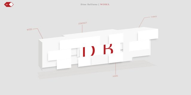
Dino Balliana
Dino Balliana offers its online visitors two styles for the navigation menu. The first option is standard: it is regular and plane; whereas the second one is three-dimensional and solid. You can switch between these two and choose your preferred one.
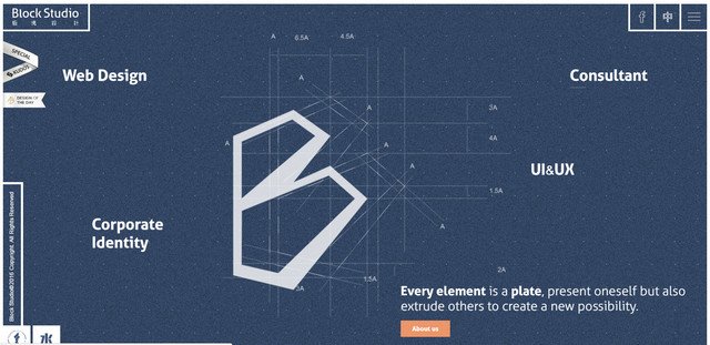
Block Studio
Block Studio’s front page has a distinct high-tech vibe enhanced with some corresponding animations. Although the menu is merely a set of 4 links, nevertheless, thanks to a skillful organization they ideally blend into the environment, finishing off the look and playing an integral part of the composition.
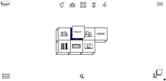
Off-Box
Off-Box goes for a simplicity that is subtly reinvented. Line style, clean and neat classy 3d presentation, a ton of fresh air and dominant white color generate a fantastic user interface.
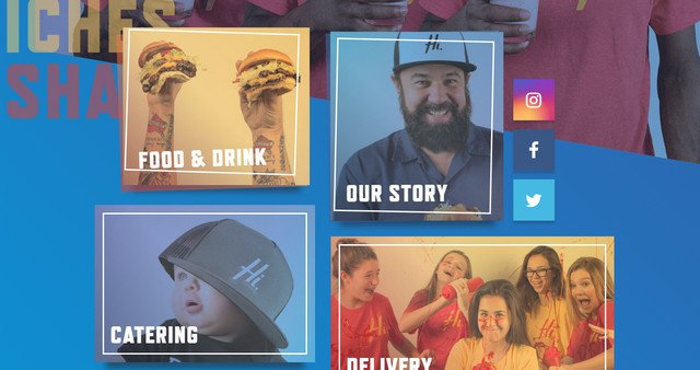
Hi-Pointe Drive-In
Hi-Pointe Drive-In is bursting with energy and positive emotions. Its main navigation is displayed as a bunch of whimsical photo-based blocks that are jazzed with vibrant splashes of color. It is a great example of how to inject some life into a common menu.
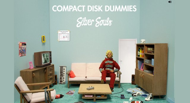
Compact Disk Dummies
Compact Disk Dummies welcomes the online audience with a 3D scene populated with numerous objects. This slightly untidy room hides all the navigation links. It is your job to find them all. Hint, hover the mouse cursor over the old-timey TV set and you will see a link to the video section.
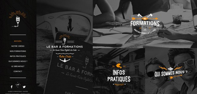
Bar Formations
Bar Formations is up to producing a strong visual impact from the get-go. Much like in the previous examples, the navigation takes in its possession the entire screen. It combines the regular sidebar panel with links and image- and video-based blocks that represent the most important sections of the website. Brilliant typographic pieces give a design special appeal.
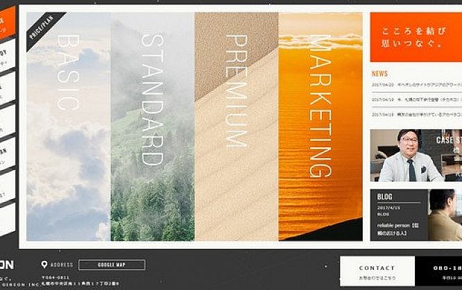
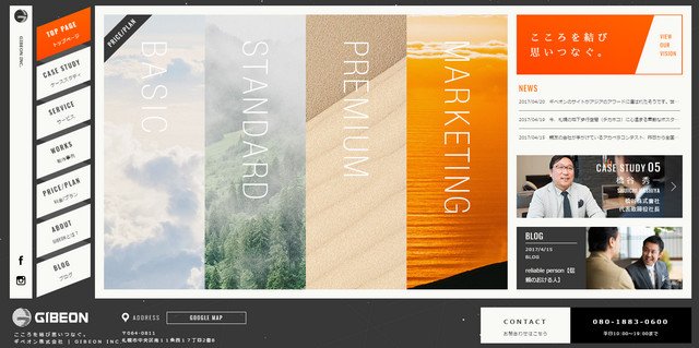
Gibeon
Gibeon is succeeded in embracing chaos. There are so many things happening here. However, the boxy structure with rigid organizational layout effectively glues everything together bringing about a more less harmonious homepage. It serves as a navigating tool.
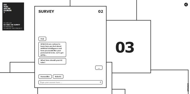
Do you Speak Human?
If the previous example overwhelms you with its content-heavy solution then this example will delight you with its neatness, accuracy and spacious. Although Do you speak human? adopts the same grid-like structure, its navigation feels much cleaner and tidy.
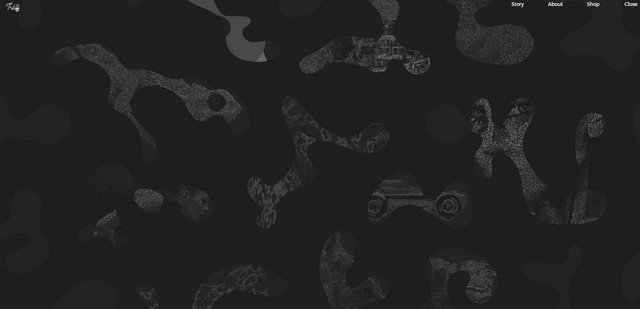
Truff
Down with the artificial angular graphics with sharp and robust feeling. Truff takes the advantage of the illustrative approach. The website is impregnated with an artistic vibe so does its navigation through the inner structure. Each section is introduced as a lively mysterious drawing.