
Maintain Focus: 20 Website Designs with Centered Layouts
Website designs with fixed width centered layouts are like a blast from the past that remind us of those good old days when a majority of web sites were based on the formerly popular 960px grid system - center-aligned and with distinctive borders. With the increasing popularity of wide screens, designers began to opt in favor of full-screen layouts that gave the content more dominant positions. Image and video backgrounds became the main visual driving force that seized the whole attention.
However, some time later, when smaller screens of tablets and cell phones began to call the tune, responsiveness came to the fore so that designers started to pay attention to the viewport of a browser. By skillfully manipulating with this key factor in mind, developers managed to save mobile users from confusion and websites from crashes. Along with fluid width full-screen layouts, fixed width centered layouts naturally direct the whole attention towards the heart of the page where the content is located. Today's article includes 20 great fresh examples of website designs that have successfully adopted this technique.
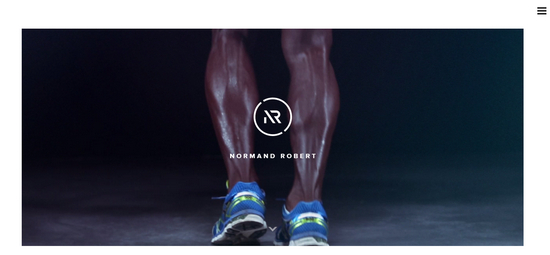
The online portfolio of Normand Robert is encircled with a relatively huge gutters that give the design a powerful open feeling. A generous amount of white spaces in tandem with an almost microscopic hamburger button naturally put the content above everything, making it instantly strike the eye.
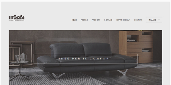
inSofa boasts of a marvelous boxy appeal that envelopes users with a strong yet refined atmosphere. It perfectly collaborates with ghost buttons, and sharp and robust typography; here, fixed width centered layout fits like a glove. In general, the front page achieves an absolute harmony.
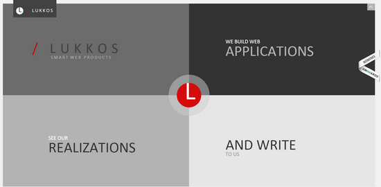
Lukkos: The landing page is broken into 4 pieces in order to effectively embrace all the necessary information that should be dished up at the first place. While solid color backdrops, sleek typography, grayscale coloring and geometric shapes create the overall esthetics, the fixed width centered layout puts all the pieces together.
On the grid vividly demonstrates how to get the most out of subtle and delicate line style. The homepage looks minimal yet sophisticated. Contour graphics, ghost buttons, obvious delineation of widgets, modules, and essential blocks enormously add to the general feeling. Here centered layout keeps everything within one frame.
Although Machiterra does not employ obvious borders or gutters along the layout and leverages fullscreen background, yet it is quite evident that every integral part of the composition is concentrated in the heart of the page and does not go beyond it. Such solution allows users to easily focus on more important things, leaving the decor behind.
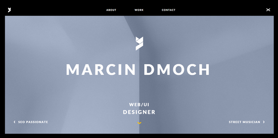
Even despite of utilizing pretty gloomy color scheme, Marcin Dmoch has a visually-appealing online portfolio that certainly awakens some interest. Black that filled all the white spaces adds a nice twist to the design. Centered layout that tries to seize as much attention as possible displays the info about the artist in an unobtrusive manner.
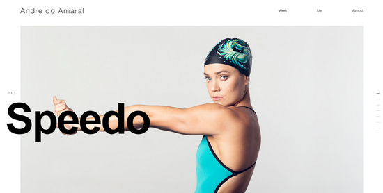
Andre do Amaral skillfully reinvents chaotic appearance by implementing fixed width centered layout that gives the front page a lovely zest. Having started his acquaintance with online visitors through showcasing his best works, the artist gets straight to the point and aims at potential clients right away.
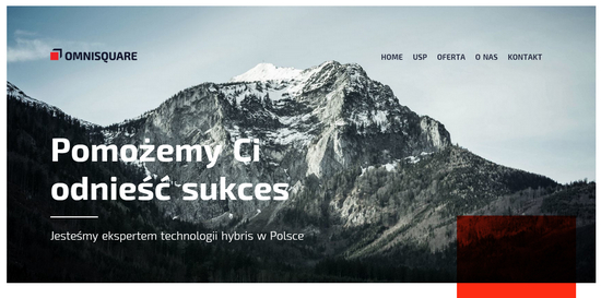
Omnisquare turns sharp appeal of geometric shapes into its advantage, providing the home page with a majestic trendy feel. A tremendous amount of white spaces, semi-transparent complementary details, matching image backdrop, boxy layout and strong coloring produce a powerful effect.
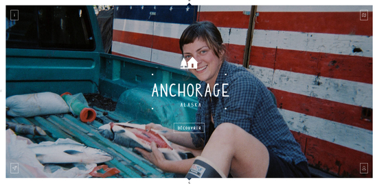
Although Local Eyes Project begins with a series of short videos that take up the entire browser screen; however, the rest of the website is based on centered layout with a fixed width that capably features images and videos, calling the attention right into the middle of the page.
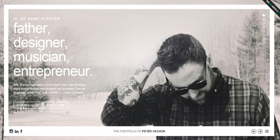
The Portfolio of Peter Vachon easily puts the emphasis on relevant information, including bio, works and skills of the artist, thanks to the well-thought-out organization and center-aligned structure. Full-screen photo backgrounds nicely cooperate with this solution, sprucing up the appearance.
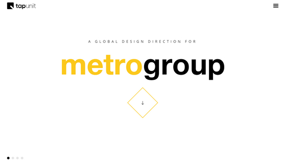
Tapunit skillfully combines vertical and horizontal sliding techniques in order to enrich user experience and break away from other competitors. Clean appearance achieved through a ton of white spaces and beautiful light coloring in pair with centered layout simply works wonders to this minimal website.
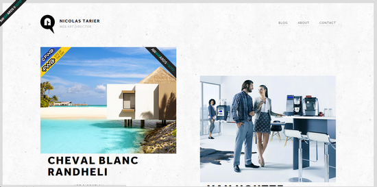
Personal portfolio of Nicolas Tarier achieves a simplistic look by opting in favor of clean white monochromatic backdrop, common type and absence of lush decorations. Nevertheless, this does not stop it from obtaining an eye-catching appearance that appeals to regular users. The skillful combination of disproportionate 2-column body and central arrangement enhance the user experience.
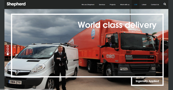
Shepherd keeps essential stuff within a center-aligned frame that has bold borders on the first subpage. The approach helps to maintain users' focus on vital information, and at the same time, improve the general feeling.
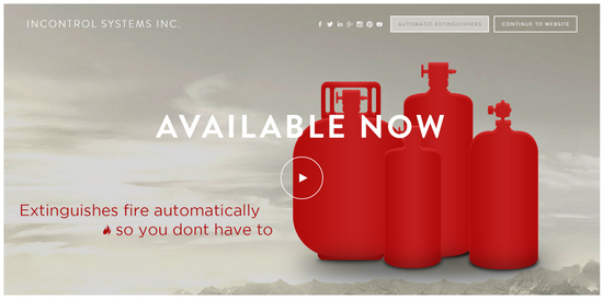
Incontrol systems has a quite refined and subtle appearance that balances background and foreground with an ease. Everything stays within fixed width layout that lets not overpower users and turns each piece of data into a focal point.
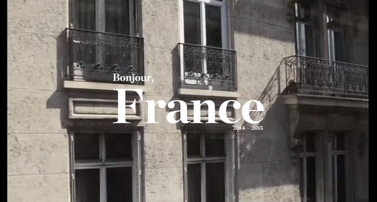
Bonjour France is managed to achieve the simplistic look that is straightforward to the audience. Although the website features plenty of images and videos, however, thanks to the carefully planned white spaces, paddings and gutters between blocks in collaboration with a fixed width centered layout, it provides users with an excellent readability.
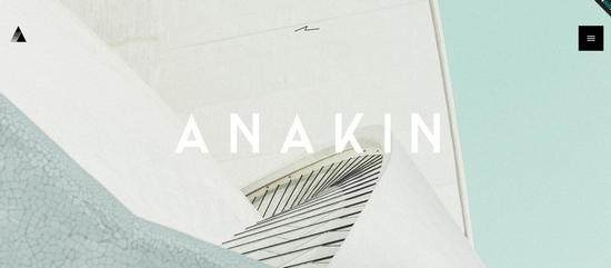
Anakin Design Studio is one of those that produces the favorable first impression that lasts for a long time. The online portfolio is stamped with a powerful personality of the creative team behind it. The landing page exudes an image of modernity and sophistication achieved through several flawlessly executed trendy solutions.
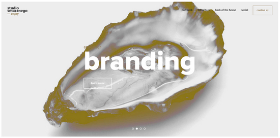
Studio Smacznego features a win-win combination of line style that is used for prettifying graphics and fixed width centered layout with small yet evident gutters. The website looks consistent across popular devices including desktops, tablets, phablets and even cell phones. The design esthetics stays the same along all the transformations.
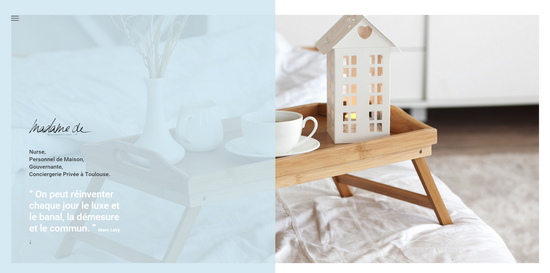
Madame-de is a great example of how to properly leverage modern design trends and not overwhelm online visitors. Thus, the front page is based on a stylish 2-column body and a robust fixed width centered layout that are enriched with beautiful coloring and some complementary details that significantly add to the overall esthetics.
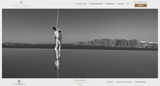
The official website of Katikies Hotel saves open feeling that fills the design with fresh air in all versions. Grayish coloring, flat style and well-balanced arrangement of the integral blocks take the design to the completely new level.
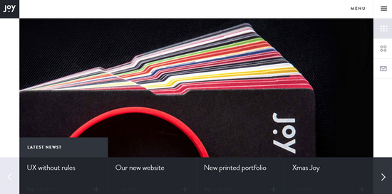
Joy Intermedia owes its splendid appearance to a skillful manipulation of squares and rectangles that not only provide the website with a nice boxy feeling but also make everything look balanced and well-proportioned. Here, fixed width centered layout supports the whole construction and reinforces the theme.
Conclusion As any trendy technique, fixed width centered layout is not a universal solution that can benefit each project; however, when it finds its matching environment, it is able to significantly enhance the overall design and strengthen the general impression. Tell me what do you think about it? (dpe)
These websites are really interesting with centered web design layouts.
Some of the websites are gorgeous. Some nice typography with some beautiful images, really does look stunning.