Taking A Closer Look at Twenty Twelve: WordPress’ Latest Flagship Theme
Every year, the WordPress team releases a flagship theme, that goes by the name of Twenty-Something. We’ve had Twenty Ten and Twenty Eleven so far, and this past week, WordPress provided us with another addition to the line-up: Twenty Twelve! It's an easy guess to relate the names to their release years. Even though it is a bit late and we are already in the later half of the year 2012, who wouldn't want a good WordPress theme?
Following in the footsteps of its predecessors, Twenty Twelve has a lot of expectations to meet and shoes to fill. In this article, we shall take an in-depth look at the latest flagship from Automattic.
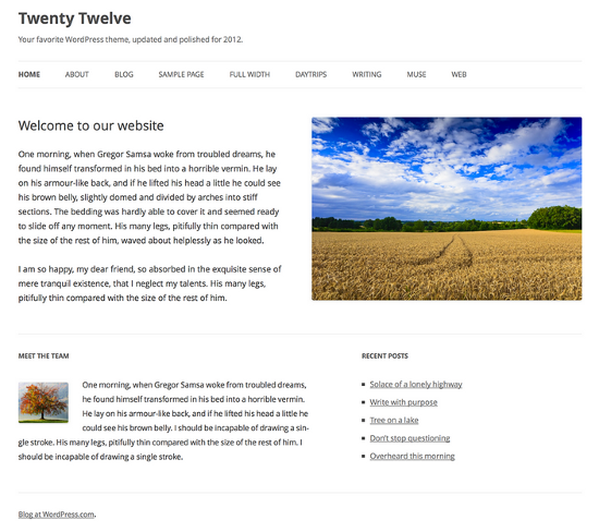 Of late, WordPress is being used to create websites of different genres -- enterprise entities, news and magazines and even e-commerce sites. One can safely conclude that WordPress is no longer a mere blogging tool. Obviously, Twenty Twelve acknowledges the fact, that WP now has a user base beyond blogging. The home page does not list blog posts in the traditional style by default -- instead, it has special areas and widgets for text and other content.
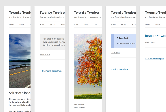
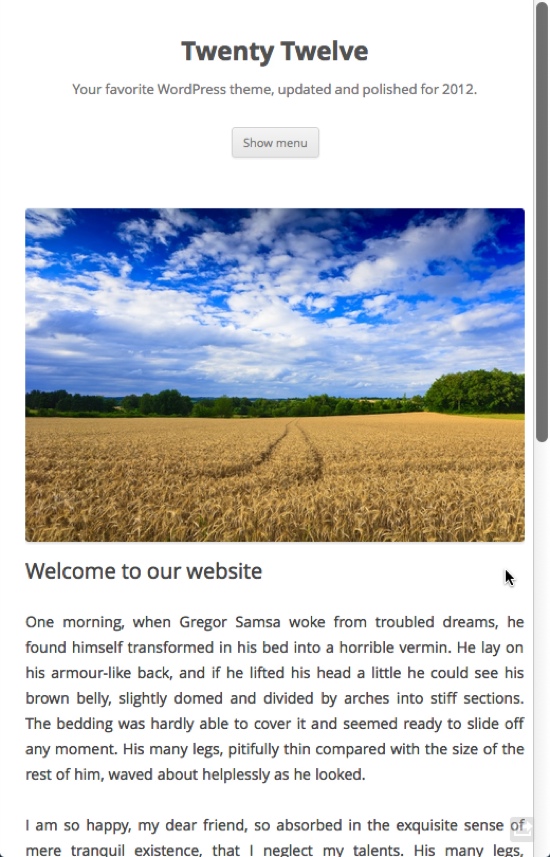 TwentyTwelve scaled down to mobile client size[/caption]
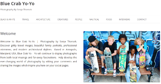 Pictured: BlueCrabYoYo Homepage using Twenty Twelve[/caption]
The custom homepage of Twenty Twelve is definitely one of the most loved (and hated) features. While some users are enthusiastic about its layout, others are genuinely unimpressed. In hindsight, not so long ago, WordPress itself claimed to be a blogging tool first, and anything else afterwards. The homepage layout, while looking absolutely impressive and useful, quashes the earlier claim. Of course, you can always retain the blog-based layout.
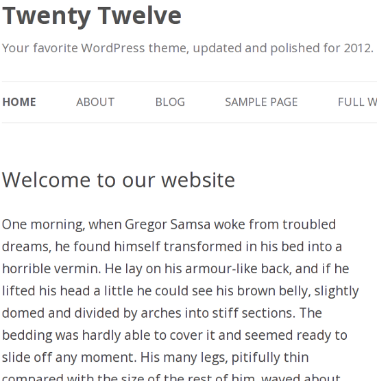
 Speaking of widgets and sidebars, Twenty Twelve has a No-Sidebar template. In fact, even the Primary Sidebar won’t show up on standard page templates if it does not have any widgets.
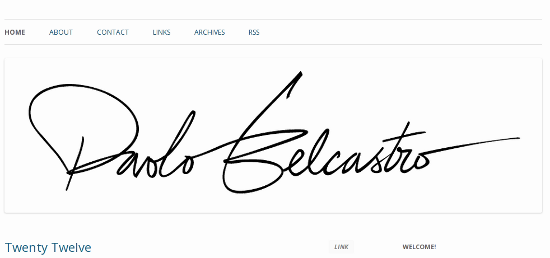 Pictured: Paolo Belcastro's Blog using Header Images in Twenty Twelve[/caption]
Along similar lines, featured images are not displayed as gigantic banners at the top of posts and pages.
Introduction
Designed by Drew Strojny of The Theme Foundry, Twenty Twelve is an elegant and responsive theme. If you take a casual look at the theme, you’ll notice that it isn’t entirely like those blogging themes out there. Of late, WordPress is being used to create websites of different genres -- enterprise entities, news and magazines and even e-commerce sites. One can safely conclude that WordPress is no longer a mere blogging tool. Obviously, Twenty Twelve acknowledges the fact, that WP now has a user base beyond blogging. The home page does not list blog posts in the traditional style by default -- instead, it has special areas and widgets for text and other content.
Digging Deeper
So, what does this theme have in store for us? Let’s take it for a spin!Mobile-First Layout
When WordPress 3.4 was released, one of the most talked-about features was the support for retina displays. Twenty Twelve does not disappoint in this section. The theme has a mobile-first layout and is totally responsive. It can be viewed on any device (well, almost) -- smartphones, tablets, HiDPI screens -- you name it! [caption id="attachment_71291" align="alignnone" width="550"] TwentyTwelve scaled down to mobile client size[/caption]
Special Homepage Template
As mentioned above, the homepage does not enlist blog posts in the traditional style. Instead, it serves as an introductory or landing page for your website. You can add text, images and other media in the upper section, and use special homepage widgets in the lower region. [caption id="attachment_71276" align="alignnone" width="550"] Pictured: BlueCrabYoYo Homepage using Twenty Twelve[/caption]
The custom homepage of Twenty Twelve is definitely one of the most loved (and hated) features. While some users are enthusiastic about its layout, others are genuinely unimpressed. In hindsight, not so long ago, WordPress itself claimed to be a blogging tool first, and anything else afterwards. The homepage layout, while looking absolutely impressive and useful, quashes the earlier claim. Of course, you can always retain the blog-based layout.
Typography
Nothing much to talk about here except for the fact that Twenty Twelve comes with the Open Sans typeface.
Post Formats and Widgets
Obviously, Twenty Twelve comes with support for multiple post formats. Depending on the format, posts are formatted differently than standard blog posts. Speaking of widgets and sidebars, Twenty Twelve has a No-Sidebar template. In fact, even the Primary Sidebar won’t show up on standard page templates if it does not have any widgets.
Header Images
Both Twenty Ten and Twenty Eleven loved header images -- they went as far as having their own set of pre-loaded header images. Twenty Twelve, however, does not come with default header images. Furthermore, unless you yourself upload a header image, the header image section itself is not displayed. [caption id="attachment_71275" align="alignnone" width="550"] Pictured: Paolo Belcastro's Blog using Header Images in Twenty Twelve[/caption]
Along similar lines, featured images are not displayed as gigantic banners at the top of posts and pages.

Twenty Twelve is a logical step in theme theme design for WordPress. Mobile first requirements are fully satisfied. The layout is minimalistic, I like it very much. Homepage function is perfect for easy stepin for using it as cms… I used twenty eleven as I was redesigning my own theme… now, because redesigning takes longer as aspected, I will change to Twenty Twelve… Oh well that’s a fine theme :D
I wonder what 2013 will bring :)
I like the new theme, especially because it does not have a default image larger than than half the screen wasting space on it. always thought that was such an incredible waste of screen space.
Al
I loved the focus on the header with the Twenty Eleven theme – will be interesting to see how Twenty Twelve shapes up.
I’ve been playing around with Twenty Twelve ever since they started using Github. I love the simple layout and lack of header image by default.
My only grip with it, although it’s a simple design, it’s not as easy as you would think to do customize it.
Any question asked about modifying a default WordPress theme is followed by an automated “Use a child theme” response. If not offering options to customize it, such as a couple of layout options, even a color scheme, some thought into making it easy to customize would of been nice. The average user isn’t going to be able to figure out how to add an extra sidebar properly, or add a new menu as easily as they could with previous default themes.
With the use of rem values instead of px, it makes it difficult to make proper adjustments to the theme structure.
In my opinion Twenty Eleven, for a default theme, had far too much custom design with it’s large header images, wasted space and excessive padding, but the few options it did have were perfect.
Having preloaded header images makes it easier for new wordpress users to understand and tweak the layouts. I feel most newbies would search for answers to how do they insert images in header. WordPress should think of adding that feature in the next version of this theme.
Mobille layout is a good addition.
Hope the theme becomes available for wordpress.org users soon.
Wow I love your site !!!
I just transfert to Twenty Twelve because I was using a plugin I needed that wasn’t compatible with Twenty eleven. I find that Twenty Twelve is a little harder to tweek but is very stable.
My web site is for a very technical audience and have put in a few hours to find the right plugins.
I’m happy with the functionnal results !! I will be officially on next week but it is not closed to visitors.
Keep up your good work and I wish that I could do web sites like yours !!
(Sorry for the spelling my first laguage is french !)
Love to know about twenty twelve wordpress theme and it’s usability, thanks for such good post.
Thanks for this review of Twenty Twelve. To make it even more mobile I decided to integrate jQuery Mobile into Twenty Twelve. For those of you interested in this you can find it on http://t12jqm.webdesignforbeginners.info/
I love Twenty Twelve and use it but how do I change the use of the word ‘reply’ to ‘comment’?
Thanks!
I really liked the responsive mobile feature. Since I went from 2010 to 2012, though, I really miss the sidebar feature. It would have been nice to allow two columns and placement of the sidebar in column 2, not at the bottom.
Are there any plugins out there to make this happen?
Thanks!
The theme is definitely minimalistic and beautiful, but I hate the way links are displayed. Those underlines break the harmony. I tweaked the style sheet to remove the underlines form the widget area but then I observed the space utilization around the widgets is clunky. Had to revert back to K2.
Thank you for sharing this insight. I enjoy the Twenty Twelve WordPress theme but find the customization options not as clear as they could be. Responsive design features are nice, its becoming a true mobile world. Thanks for sharing.
Do you know of a good content slider for Twenty Twelve? I’d like something that I could potentially use with WooCommerce.
Hi Kyle,
I just started using this theme two days ago. It is also my first wordpress theme in general.
So far I don’t mind it, although i still tinkering about to get the font / background colours i want.
Apart from that, it is a clean layout, and for someone after a basic theme, i think it is fine.
James.