The times of gloss and 3D effects are over – at least for now. The trend in web design goes towards minimalism which is also reflected in the style of buttons. The hot so-called ghost buttons fit perfectly with the reserved look of modern websites based on
flat design or even more trendy material design. Ghost buttons basically consist only of a very thin outline with some text in it. They can hardly be created more basic – at least, if you want them to be recognized as what they are.
[caption id="attachment_87738" align="alignnone" width="550"]
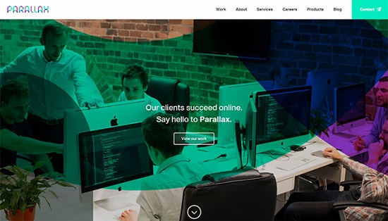
Parallax website with simple ghost buttons[/caption]
Easy to Design and Mark Up
Ghost buttons have a very basic design and can be easily marked up through a style sheet. For classic buttons created with a <button> or <input> element all you need to do is choose a border color and remove the background as these elements have a background color by default.
1
2
3
4
5
|
input {
  background: none;
  border: 1px solid black;
  color: black;
}
|
However, a button is not always created with a button element. They often contain links which are marked up as an <a> element. Designing them is as easy as winking. Visually, there is no difference between real buttons and simple links.
The Background Counts
Minimalism alone is not a guarantor for a well made website. The same applies to ghost buttons. Important for its success is a surrounding that makes the buttons look sophisticated and preserves them from getting lost somewhere in the background. They particularly look good on large-sized expressive photographic backgrounds,
so-called hero areas, which also seem to be
very popular these days. Most ghost buttons don’t execute classic button functions like sending a document. Usually, they mark links. Have a look at the examples of the Parallax and Creative Ad Awards agencies where ghost buttons link to work samples. They are placed on photos which (almost) fill the whole browser window.
[caption id="attachment_87735" align="alignnone" width="550"]
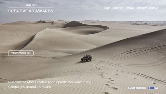
Creative Ad Awards website[/caption]
Apart from large-sized photographs, format-filling background videos become more and more popular. Combined with ghost buttons they can make a lasting impression. Due to their basic design, ghost buttons don’t take much space and are not too obtrusive, so visitors can enjoy the video. The right contrast keeps the buttons visible and makes them stand out from the animated background.
[caption id="attachment_87739" align="alignnone" width="550"]
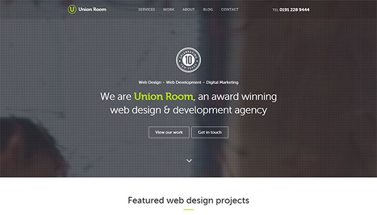
Union Room website with video background[/caption]
Shine with Details and Special Features
If you want to jump on the ghost button bandwagon, you should make your buttons special. This can be quite challenging with a minimalist design. Hence, you really need to think through how to give your button a distinctive character. Thanks to CSS3, there are virtually no limits to your creativity. You can work with rounded corners and transparency, use expressive fonts, and come up with discreet animations and transitions.
[caption id="attachment_87736" align="alignnone" width="550"]
Iuvo website with animated ghost buttons[/caption]
Animations don’t have to be as complex as in the above example. Discreet fade-in and fade-out effects are often more elegant. You could even animate the button outline – just like the developer Nicolas Zezuka did.
[caption id="attachment_87737" align="alignnone" width="550"]
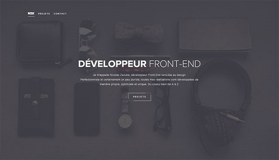
Website with a simple animated ghost button[/caption]
Ghost Buttons are Not Limited to a Link
Ghost buttons are not limited to a link function. They can also serve as radio buttons. The Couple app website uses ghost buttons to select a gender.
[caption id="attachment_87734" align="alignnone" width="550"]
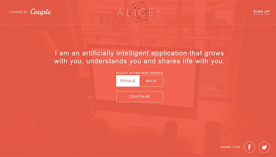
Website with radio ghost buttons[/caption]
Many ghost buttons are designed to change their outline color and form, or color the background when you hover over them. Alternatively, you can animate the button text, so that it disappears to one side, or, if you prefer, change the text while hovering over the button to add additional information.
[caption id="attachment_87733" align="alignnone" width="550"]
Website with animated button text[/caption]
Conclusion
Ghost buttons can be really impressive if applied correctly. The examples show that a good background is vital and animation effects give them an individual note. The more basic the design is, the more concise it must be. This is the only way to stand out from the mass and not get drowned in the crowd.
(dpe)

To design and develop great websites, you have to have talent and you have to speak your mind. That makes projects go smoother and makes lunch more interesting too…..
Of course those ghost buttons concept is very innovative as a developer we all need to be aware of this> Thanks a lot for giving me a brief description on that.
Really like the minimalism of ghost buttons but I wonder sometimes are they buttony enough!!? Will people see them and think oh that’s a button – maybe we need to add some more subtle elements to them like slightly coloured backgrounds or a pulsing border or something like that….
Unquestionably, Ghost buttons are really good for web designing. They provide more clarity to your website and your background will not be hidden.
Thanks for the insightful tips Denis! I’m really enjoying the minimalist take on design in web design lately! I think that ghost buttons assist with call to actions as they are more subtle and inviting.