
Opposites Attract: Tips for Designing a Clean Yet Colorful Website
Let’s think about this a moment. What does a clean design mean? Most can probably agree that a clean design is one that is consistent and streamlined so that every element is balanced, clear in its purpose, and looks like it belongs in that exact spot and as a part of the whole design. A clean design doesn’t have to be minimalist, however, which is why the colorful part works well in conjunction with a clean design.
In fact, a clean design can even have animations, parallax, and other extras. What distinguishes a clean design, though, is that it flows together so perfectly that navigation is a breeze and the purpose of the site is clear right away. For visitors, the entire feel is professional and high quality. The color aspect of a clean design is where you can add in the personality of the site. You can limit colors to small, consistent parts of the design, or you can use bold blocks of color throughout. To keep from going overboard with too much color, though, you will need a clear plan and color scheme. Let’s take a look at these and other best practices below to help you better design a clean yet colorful website for your clients.
Non-white Space
Lots of white space is a must in a clean design. White space keeps a website from looking cluttered, and it also helps lead the eye to important information. But white space doesn’t have to be white.
Rubrasonic
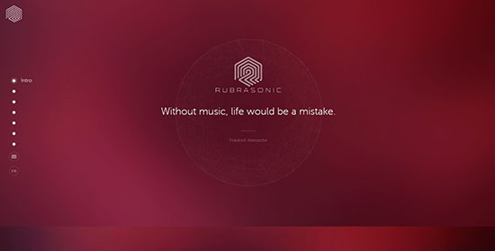
The Rubrasonic website is not only clean but quite minimalist in its content. Lots of white space makes it easy to decipher quickly what the service offers - custom music for commercial businesses. The animated gradient colored background, while normally being obnoxious on most sites, is indicative of sonic sound waves, which is why it works here.
Mooze Design
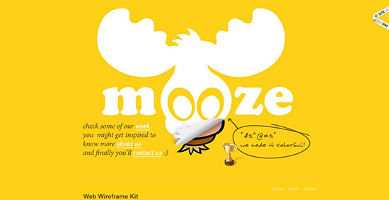
Another website in which the background is colored, this website leaves plenty of white space between content. The single page design includes navigation links that jump to other sections on the page, making it easy to quickly find the information you need. The pop-out info boxes on the founders’ names are just one of the examples of “fun” factors in the design.
Precise, Bold Color
Use bold, solid colors to create distinction between sections, but be careful to not overdo the design with too many extras on top of all the color. For instance, try to use only subtle textures. Gradients and patterns should be used with extreme caution but can work if colors are pale or subtle. You can also use bold colors in boxes or buttons.
BarCamp Omaha
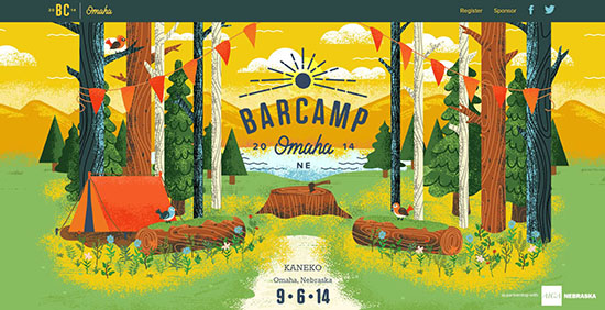
Beautiful, colorful illustrations fill this single page website for an entrepreneur event last September. The layout is still clean, even with all the color. Plus, each section has its own look, keeping the information easy to digest. This website is a great example of a fun design that maintains a high-quality look and feel, thanks to the clean design elements.
Jolby & Friends
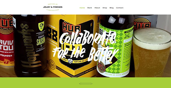
This collaborative studio’s website has both a colorful and very clean look. Why? For one, the colors are broken into large blocks for each section. Even the images, which are in vivid colors, look organized in their grid layout. The video slider in the hero section includes bright colors. And although small amounts of texture can be found throughout the rest of the site, they are used to help draw the eye to important information - a smart, subtle strategy.
Large, Bold Images
One excellent way to add color to a website is with large, bold photographs or illustrations. You can place them throughout the site, keep them in the header, or even line the entire background with image boxes in a grid layout.
Beaver Lab
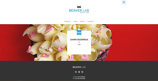
This identity/web design agency uses a slider on the homepage displaying full-width photographs of their work. Other subtle colors are used throughout, which goes to show that sometimes a website only needs splashes of color, possibly only found in the images.
Apres Ski
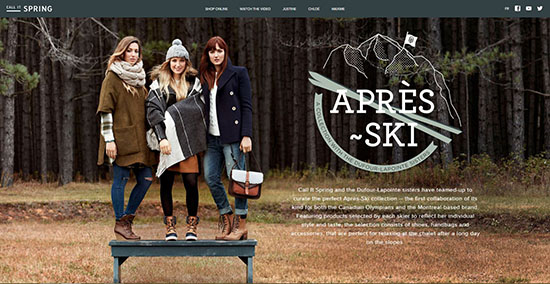
This boutique collection of snow ski accessories and clothes uses beautiful, sharp photographs for the background. The hero section uses a full-screen shot, but scrolling down, while the photographs still line the entire background, images are broken into smaller, creatively placed boxes.
Clear Color Scheme
It’s perfectly fine to have more than a few colors on a website and still be considered a clean design. The colors simply have to have purpose and remain consistent in their use. A clear color scheme gives certain colors specific purposes, such as fonts remaining white while the backgrounds of different sections are in 3 different bold colors.
Big Eye Deers
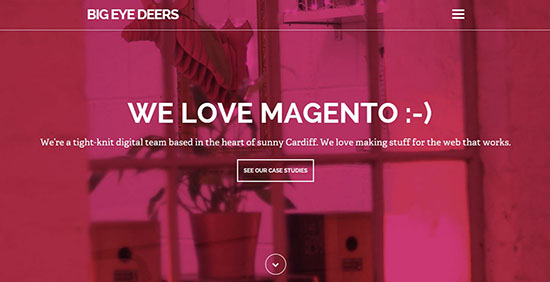
The website for this digital team seems to incorporate a color scheme in which magenta, white, dark gray, and light gray play a part. For instance, the magenta is used for the title, headings, image overlays, icons, and the footer. Light gray is used for body text. Although magenta is the only bright color in the scheme, the entire design appears colorful due to the vivid photographs and magenta overlays. The strict assignment for colors along with a very tight alignment makes this website an excellent example of a clean yet colorful website design!
XGraphica
The full-screen photographs on this web page all have a subtle purple overlay that matches the rest of the purple color scheme, an excellent way to both use photos and ensure a smooth color flow throughout a site.
Hierarchical Typography
Rather than using loud, color-crazy arrows or badges everywhere to point to important information, good designers know to use hierarchical typography. Bold, big fonts for titles and headings or even different colored fonts are a great way to help information flow. Just make sure that any colors used for text stand out well from the background!
Bench

While the color scheme remains quite simple on this bookkeeping website with mainly white and grays and accents of orange and blue, the design also incorporates colored icons and vivid photographs. The entire look is very clean cut and professional in its look but also personal due to the pictures of real team members and even of clients. One of the main reasons the look is so sharp is due to the excellent layout of information and font use. For instance, main headers use a large, dark gray font; subtitles use a medium-sized dark gray font, and body text uses a small, light gray font.
Greenhouse
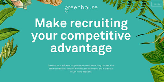
The gorgeous full-screen illustrated background captures attention right away on this website for a recruiting software, and the big, bold font definitely draws the eye. The same aqua colored background continues through the introduction as you scroll down the page, and all of the information is cleanly laid out in a grid. Fonts of different colors and sizes keep the information flowing smoothly down the page. Click on any of the links to see more pages rich with beautiful illustrations and well-organized text.
Simple Navigation
One of the “biggies” for a clean design is simple, easy to use navigation. Links do what they should, menus are accessible, and information is clearly organized. Use drop down menus if needed for websites with lots of content.
Pollenize
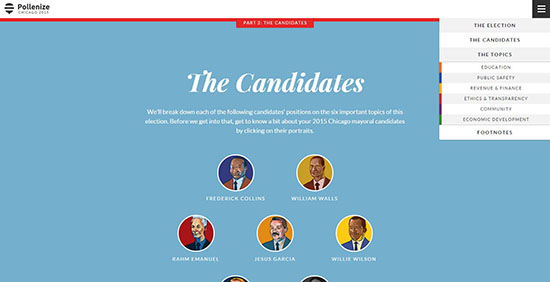
Created as a way to keep constituents informed on candidates in upcoming elections, this website contains a LOT of information within single campaigns. For instance, the upcoming Chicago mayoral election contains 9 sections of information on a single page, but the designers did an excellent job of providing a drop down menu tab in the upper right hand corner. Not only that, but they organized the content into short blocks of text, making it much easier to quickly digest. And they did all this while creating a fun, colorful look for the site: Bravo!
Foco Pure
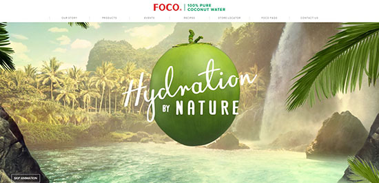
The website for the Foco 100% Coconut Water does an excellent job of organizing information into short pages, all accessible with the header navigation bar that remains visible throughout the site. Plus, the colors are vivid and bright, and the home page has an incredibly captivating animation.
Alignment Precision
Last of all (yet probably one of the most important ways to make a clean website have that highly professional look), everything should be lined up perfectly. A clean website has a pixel-perfect design. In fact, a clean website follows some sort of grid layout, which is why everything looks “snapped” into place.
Dropbox Guide

The design for Dropbox’s online guide not only uses simple navigation but also is laid out in a very neat grid. Once a user clicks on one of the guides, the title page moves to the left while the navigation menu pops up on the right. All of the menu options are in neat little colored boxes, and once you click on one, the title again moves to the left while the information pops up in a neat layout on the right.
Natrel
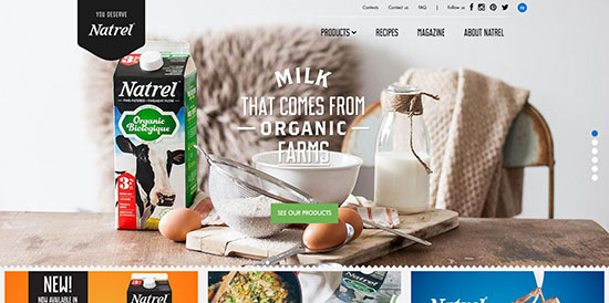
This milk company has a very colorful website, mainly due to the large photographs of their products and recipes that litter the pages. Even the drop-down product menu include images of each of the milk categories. While the site contains lots of information, the layout is clean due to an excellent grid layout found on every page.
This is very good knowledge that you have shred here. Thanks. Keep it up!
well done Tara. it was a great article to create a clean and stunning website.
i think it is also important to add a fresh and well captured background
Great article. I can already feel the heat of summer with your bright colors website ideas. It’s pretty amazing and interesting. Have you tried using bright colors for one page site?
Hello Tara,
Thanks for sharing this in-depth information for designing a perfect website. It indeed generates an opportunity for the beginners to learn and deliver better results. I really enjoyed reading all the information, Good job!