
4 Examples of Bad Ecommerce Website Design and What to Do Instead

Ecommerce has come a long way and it is easy to find websites that make shopping a joy. But there’s a seedy underbelly to the Internet, too, full of bad eCommerce website design that may mask bad business practices, mediocre performance, or even outright theft.
Whether you're starting an eCommerce business or starting your own online boutique, the UX design of your store should attract your users and improve your chances of converting them into customers.
Bonus: If you want to learn even more about detrimental eCommerce mistakes, you can find out the 15 most common online shopping problems that lead to revenue loss here.
Today, we’re going to look at four websites that show you exactly what not to do, with some hints and tips for what to do instead. Prepare for the rollercoaster that you didn’t know you needed.
Homebase: Design and Inventory Issues
Over in the UK, Homebase is one of the worst-rated eCommerce websites, according to a 2018 and 2019 survey of online shoppers. The reason customers gave it such low marks is because of its puzzling design and limited stock availability.
The website itself isn’t too bad of a design when you glance at it casually. It’s something that you might actually think about adopting until you get beneath the surface. We’re going to review just a single page, for its bathroom furniture.
See if you can spot the keyword that they’re likely trying to get the page to rank for:
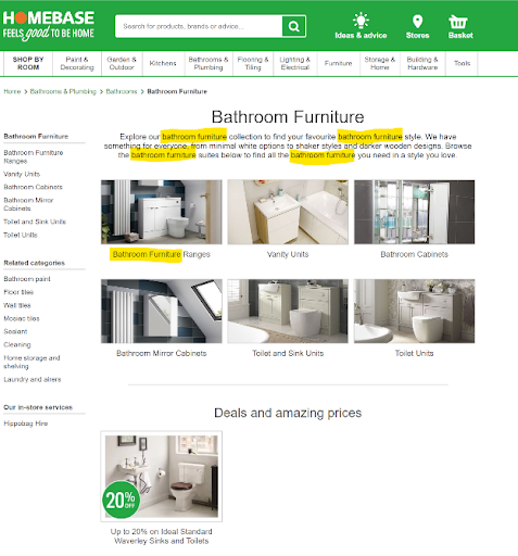
Not only is that stuffing not likely helping, but it also undercuts other elements on the page. We don’t get a lot of description beyond the company telling us that they know a lot about bathroom furniture. If that’s the case, however, then we’re going to have to ask why its image for the “toilet and sink units” and the “toilet units” show the same two products, just next to each other or with a gap.
Plus, it’s just the “toilets units” section that actually shows a product with the toilet and sink as a single unit.
Your lesson here is to prioritize copy that’s useful and avoid keyword stuffing. There’s actually some good copy at the absolute bottom of the page that explains products and collections, plus they note that some of these items can be installed by you. It would also make great content for an email or text blast.
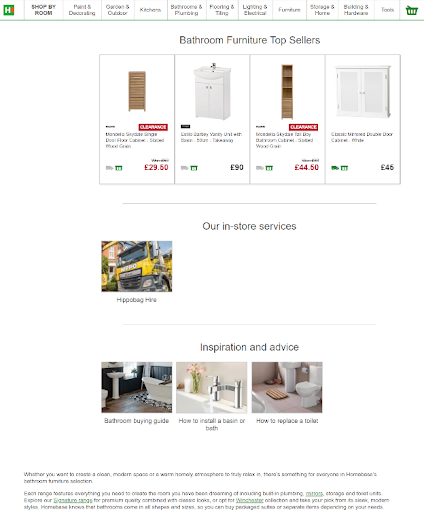
It’s unlikely that the reader will get all the way down there to read this copy, which is unfortunate. Even more unfortunate, however, is that the page only shows us 4 “bestselling” pieces (there are 6 categories) and two of them are on clearance, which doesn’t inspire confidence. The “in-store” service is actually for a service that occurs at your home (and the image we see here has nothing to do with the bathroom).
The advice section is a promising idea, but for some reason, the photos are especially grainy and they’re off-center. It’s not too bad, but once we realized that we couldn’t help but see that the text at the bottom of the page is aligned with sidebar elements instead of the other text box at the top of the page.
The lesson here is to test your design for style and looks, but also make sure that it gives useful and related elements that don’t cut against the page. Would you take design inspiration from a site like this?
Headhunter Hairstyling: Making Us Hunt, Slowly
Headhunter Hairstyling and Nails is a Pensacola, Florida, hair salon that’s been in the downtown since 1978. They have great reviews on Google and are a super popular location with people who find them through Yelp or walk in off the street. It seems like a wonderful place to get your hair cut or styled and they deserve credit for running a good business.
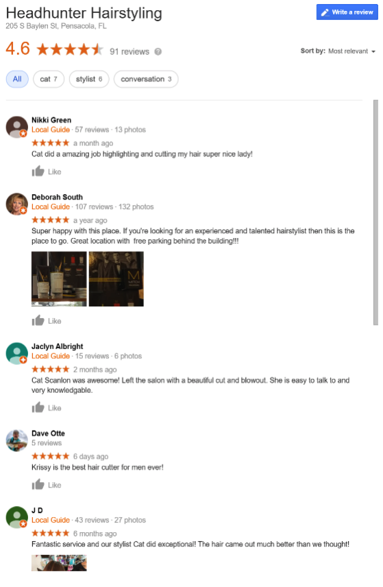
The company isn’t particularly an eCommerce business, but that’s why we’re highlighting them in this section. Because, if they were an eCommerce shop, they’d likely go out of business tomorrow. No reputation in the world will save you if your website operates like there’s does.
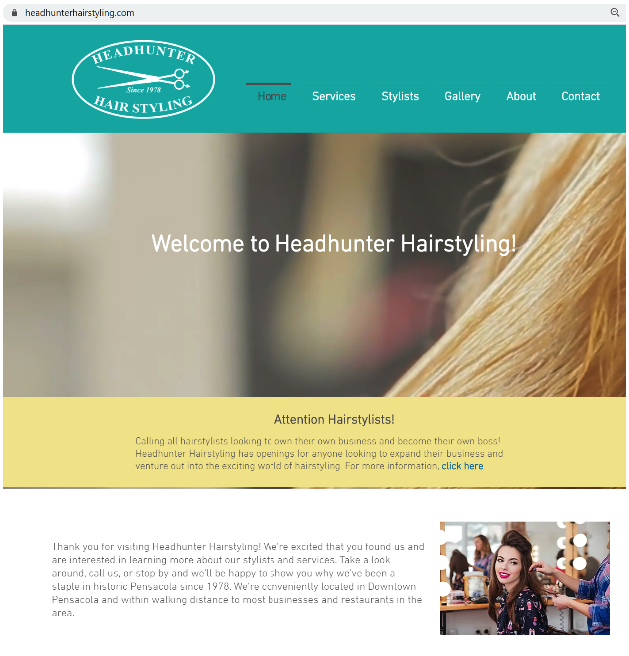
The first thing to note is that you’ve got a great big video of someone cutting hair and you’ll get to see it in intricate detail as it slowly, slowly loads. First, the video loads fuzzy, then comes into focus, and then slowly the rest of the site content will appear.
The lesson here is that a load time of 5-6 seconds will kill an eCommerce business. You’ve got to fight to keep it under that.
Next, look at what they do with that all-important real estate. Over the hero video, we just get a welcome and repeat of their name. Below, we get a static note about hiring — which may be the parent company’s focus but isn’t the focus of this service-oriented site (you can tell because there’s a “Services” nav at the top). In our third and final text segment, we get a welcome message that talks about the location (a small plus for a business that needs foot traffic) and a mention of services, but no hyperlink.
For you, think about what you would do with a landing page? How would you sell? Are you pushing products as soon as someone arrives or are they met with bland copy, no links, and no reason to stick around?
There’s no easy way to get to a service or stylist as we read. You’ve got to go back up to the top nav. Clicking on the “Services” tab takes us to a page with a price list.
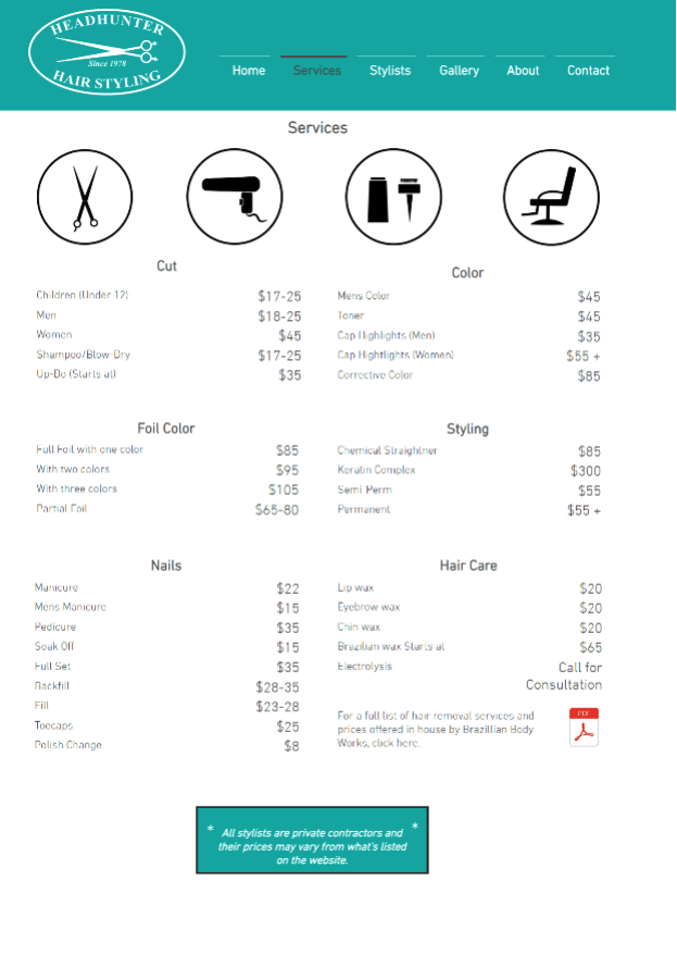
Unfortunately, there’s no video or images here, just a straight service list. There’s also no more information because you can’t click through to anything. What all does that elusive plus “+” sign next to the permanent styling cover? Can the price double or even triple?
Then, we get to the bottom and are told that none of those prices matter. So, there’s no information here and no reason to trust anything else on the site.
Your eCommerce business can’t rely on outside sources (like Google or Yelp) for reviews to generate your sales. You need to make a good first impression and then follow it up with high-quality images, consistent pricing, and elements that help people trust you. This approach doubles customer lifetime value and significantly enhances the overall customer experience. The lesson is to ask yourself this: If you could only choose a salon based on their own website (which is what people do for your eCommerce site), would you choose this one?
Arngren: Making Eyes Hurt for Years
If you’re going to have eCommerce sites that you love to hate, Arngren.net is at the top of that list. This Norwegian classified site is like if one of those penny magazines sitting in a roadside diner was digitized, and then shoved onto a single page.
It’s a fascinating mess.
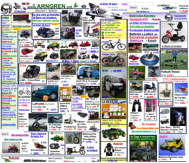
Images and text overlap each other, often obscuring essential information or making it unclear which “sale!” declaration is for which product. Some things have borders and others don’t, for reasons that are unclear. An alarm system will sit next to an RC tank, moped, and binoculars.
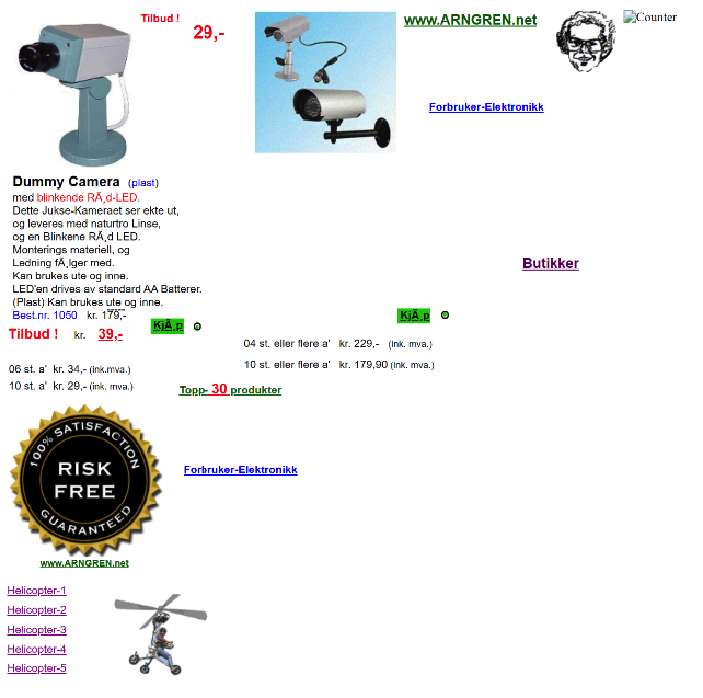
Clicking on an item will get you to a paid that is more structured, generally, though a fair amount of the links go to strange places on a page. And, for some reason, it pairs fake security cameras with ads for homebuilt, personal helicopters. Clicks may send you to affiliates or advertisers or direct listings, but there’s no obvious way to reason it out before you click.
All-in-all, it’s a masterclass on what not to look like. So, here are the big takeaways from it:
- Use a consistent layout so people can follow along.
- Minimize content per page so people understand what’s being sold.
- Give information and context to encourage clicks.
- Keep typography, color, image size, and other elements at least somewhat consistent
- Go through your links and see if things are clear and that they work properly.
Your big takeaway: If it makes your eyes hurt or gives you a headache to look at, scrap the page and try again.
T-Shirt Shop: Don’t Steal
We’ve got one quick honorable mention to note: t-shirt businesses.
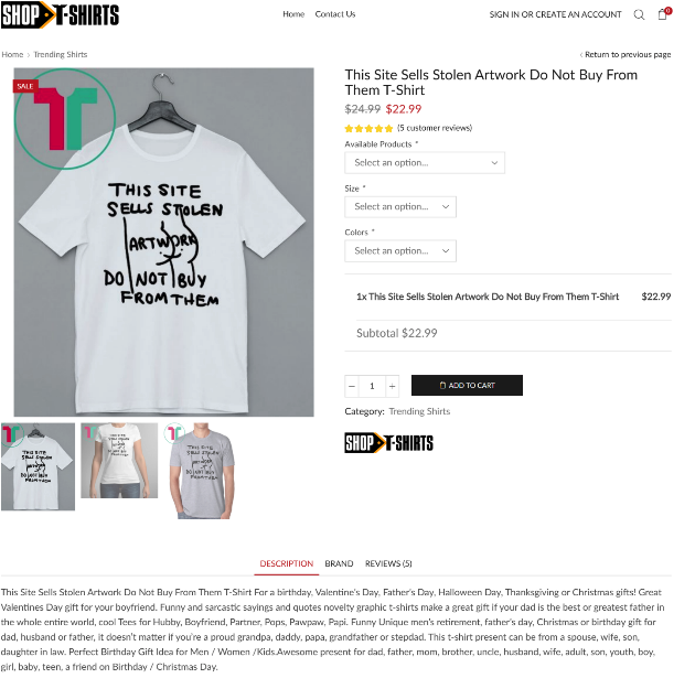
There’s a rather big controversy that’s been discovered by Twitter sleuths, where artists post artwork and then someone comments “This should be on a t-shirt.” Unscrupulous companies on the Internet are scraping Twitter with bots and then grabbing the artwork image files and turning them into t-shirts.
As a response, Twitter users started making images that note a website sells stolen artwork and then using the comments to get them to create a shirt with that image.
Twitter scraping is a bad practice for multiple reasons. First, it’s illegal and the point is to get a cool design without paying the artist for it. Second, you can get caught creating a lot of strange things (that are potentially illegal in their own right). And, finally, it erodes all trust.
Your eCommerce takeaway: Don’t steal. People will notice and spread the word, and it’ll hurt your store.
In an even greater twist, some companies have started creating their own t-shirts with similar messaging. This could be an attempt to cash in on a trend or to muddy the waters as bad actors try to show that they might not be doing something wrong.
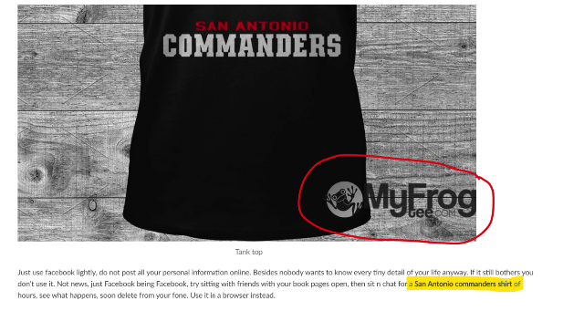
All this serves to do is erode trust — an especially bad move if you are a legitimate shop and just trying to make a buck off a trend. Also, we won’t mention this site by name, but look at the product description of that item. It doesn’t inspire confidence that the listing is real.
Elsewhere, they leave a watermark from a competitor’s store on an image and show a product description that appears to be a personal comment from Facebook that includes the keyword of the product description (still bolded on their end).
So, be careful of trends and overly enthusiastic automation. If you’re not paying attention, you could end up doing something that’ll get your shop shut down by the authorities or scare away people enough that you’re forced to close your doors because of a lack of sales.
Also, don’t steal.
Bonus Tip: Google Yourself
We’ll finish up with a final tip that came up during our research on this topic. Google is a great tool to help you find a vast array of information. We wanted to highlight websites that not only performed poorly in our mind but were rated poorly by customers.
The Homebase site was a top example, and it got us to look around for more studies in the UK. That led to Google results for one particular publication, which is currently ranking well and showed up a couple of times:
Unfortunately, those links that Google still thinks are valid aren’t helping out the visitor.
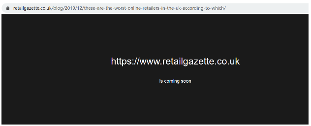
So, our final lesson is to do your keyword research and learn your site. Then, see where you show up and click through those links. Because, you don’t want a popular search result to link to a page saying that you’re “Coming Soon” when, in fact, you’re already here. You might also find new reviews that show people are worried about your shipping costs or have other concerns.
No matter who you are, search results count.
So, get checking and happy selling!