
Annual Report Design: 6 Best Practices to Create Appealing Reports for Your Company

Annual reports are a window into your company. They provide customers, investors, potential clients, shareholders, and employees with an overview of your business’ key achievements and annual performance.
They generally include the following information:
- Company history
- Vision and mission statement
- Message from the CEO or Chairperson
- Overview of the business (eg. business segments, products or services, business operations, etc.)
- Financial highlights
- Milestones
Considering how technical and in-depth annual reports can get, they often leave readers overwhelmed.
So, even though you might have an inspiring business story to share, without a design strategy in place, it’s most likely to fall flat.
Not a designer? You can get started with annual report design templates to create reports that keep readers interested.
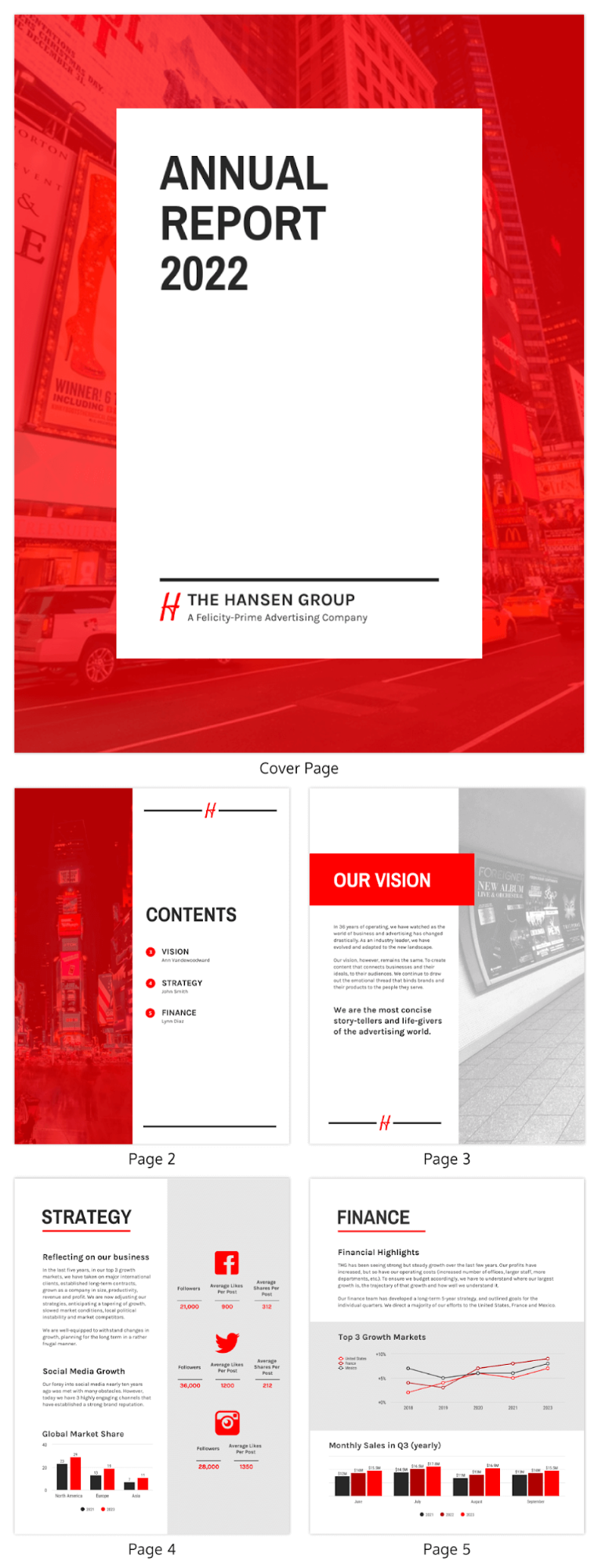
Here’s an example of a well-designed annual report. It has a consistent color scheme and accurately encompasses the company performance using visuals, making for an engaging read.
Let’s take a look at the six best practices to create appealing annual reports that people will actually read.
6 Best Practices to Create Appealing Reports
1. Design an attractive cover page
Like it or not: most reports are judged by their cover page.
A wordy and dull cover is certainly not going to pique interest in readers and get them excited to read your annual report. So, don’t let your efforts go to waste -- design an attractive cover page that captures attention and generates curiosity in your audience.
Start by establishing an overarching theme that reflects your company’s objectives and milestones. This theme will inspire design elements such as the color scheme, typography, and visuals you choose to include in the rest of the report.
Use bright colors and bold fonts that draw attention and are in line with your brand guidelines. Make sure you don’t clutter the cover page with too much text. Include minimal text that introduces what the report is about.
Be sure to add visuals in the form of abstract imagery, photos of real people, or illustrations that are relevant to the report material. But perhaps even more effective would be interactive content or a short video in the background of your cover page and there's no easier way to have access to that than by using a report creator.
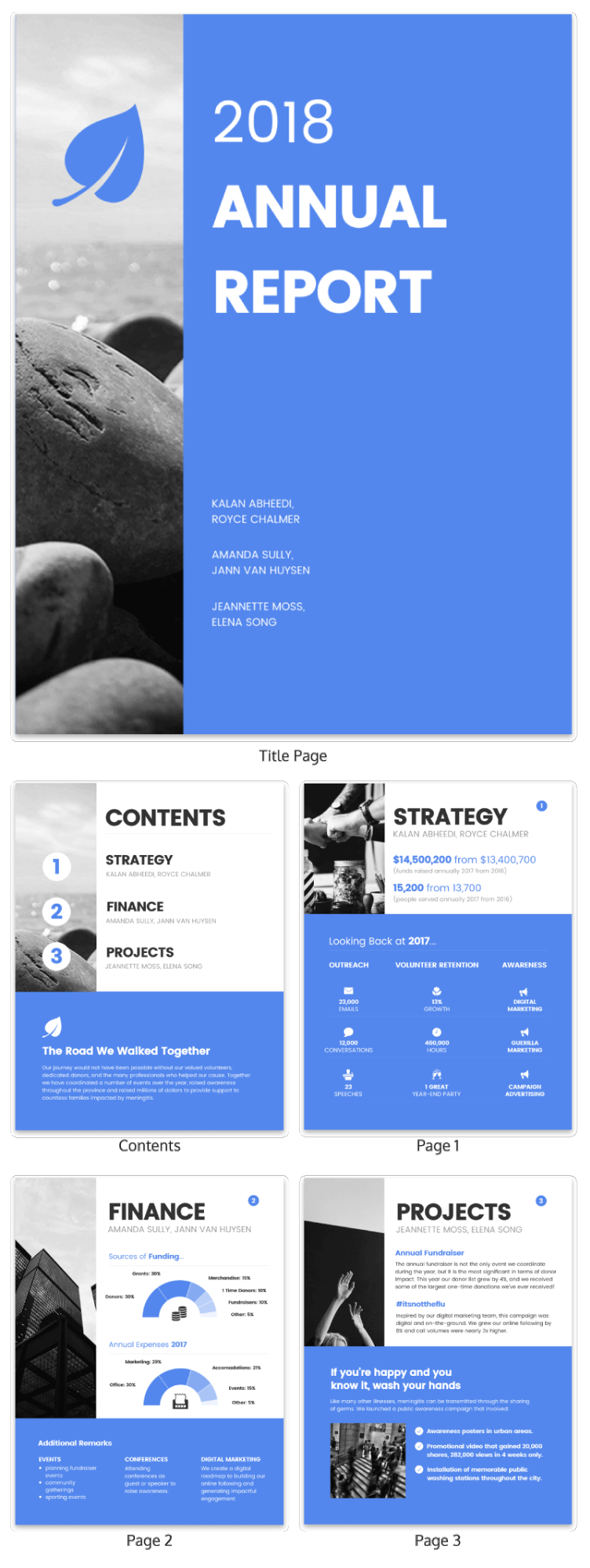
Take a look at this cover page that uses a shoreline theme. It adopts the imagery of the horizon, creating a sense of opportunity and goal-setting.
2. Create a text hierarchy
Having to read blocks of text is certainly not an enjoyable experience. It’s tiring and is sure to repel readers.
That’s why it’s always important to create a text or typographic hierarchy which means you need to implement three levels of hierarchy across the report:
- Header
- Subheader
- Paragraph
While the header is designed to be bold and grab attention, subheaders are slightly smaller and are meant to divide the report into sections. The paragraph or body is heavy on text and needs to be optimized for readability.
Establishing a text hierarchy guides the viewer’s gaze, letting them know where to look and what to read. Factors that contribute to the hierarchy include the choice of fonts, sizing, placement, and alignment.
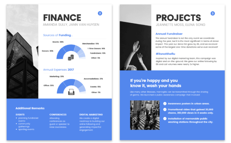
Here’s an example of a text hierarchy in an annual report. Notice how the headers, ‘finance’, and ‘projects’ are bigger and in bold, giving readers a clear understanding of the section. This is followed by the sub-headings and paragraph text in a smaller sizing.
3. Visualize your data
Data has a huge role to play in business growth and annual reports are generally filled with lots of data but what happens when you don’t present that data effectively? It leaves readers confused and overwhelmed.
This is why it’s important to use data visualization techniques to visualize data, letting readers understand and interpret it with ease.
There are different types of data visualizations such as:
- Infographics
- Charts
- Diagrams
- Maps
For example, you can use a timeline template to showcase the milestones your company achieved over the year or a bar chart to show the growth in different product categories.
Take a look at this financial projection report that makes use of three different types of charts (pie chart, bar chart, and tables) to present data accurately.
4. Incorporate icons
From adding personality and generating interest, to improving memorability, incorporating icons in your annual report design is always a good idea.
They make for powerful visual communication tools because of their ability to communicate ideas easily and quickly. You can use icons to:
- Emphasize points
- Visualize ideas
- Draw attention to important text
Regardless of whether you’re using them as standalone visuals or in conjunction with infographics or charts, make sure the icons you incorporate are in line with the overarching theme of the report.
Here’s an annual shareholder business report that uses icons to differentiate between the different categories of shareholder returns.
5. Use color-coding
No design is complete without the right use of color. What’s more, colors don’t just contribute to the aesthetics of the report, they also play a huge role in highlighting significant points and improving readability.
You can use color-coding to differentiate between multiple sections or categories. They serve as visual cues, making the information less dense and quicker to understand.
Similarly, it’s also a good idea to use color blocks to group similar or related information. This makes it easier for people to scan the page. You can also use color blocks to create page layouts or make the header stand out.
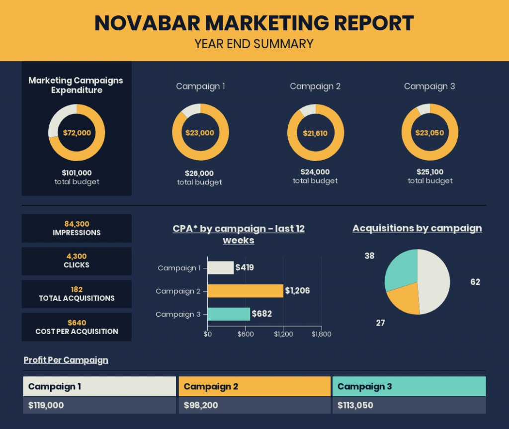
Take a look at this year-end marketing report that uses consistent color-coding to distinguish between the three campaigns.
One of the most common mistakes people make while incorporating colors is to make the wrong choice of color combinations. This makes the report look chaotic and ends up distracting readers.
Abide by the principles of color theory and opt for contrasting colors to design an enticing annual report.
6. Maintain consistency
Your annual report needs to have a cohesive look and feel. Every page needs to be tied in together so that it reads like it’s coming from one brand.
This is why it’s important to maintain consistent branding across the annual report. From the color scheme and typography to the layouts and use of motifs, you must create a visual consistency to deliver a meaningful and comfortable reading experience.
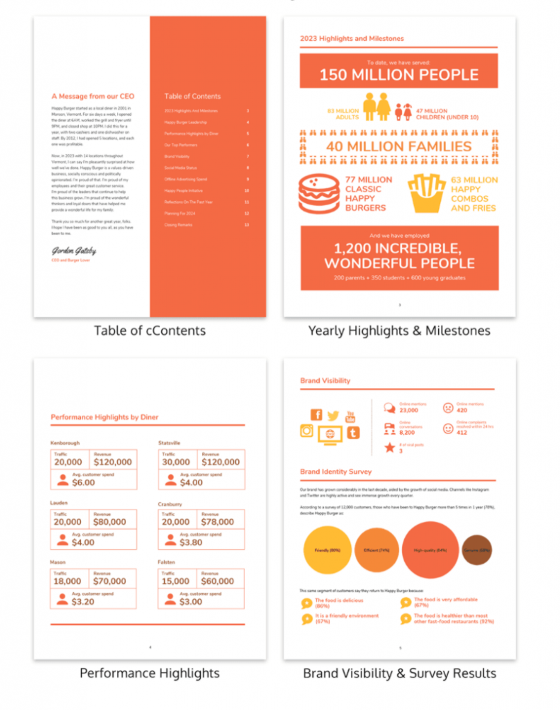
Here’s an example of an annual report design by a burger joint. Notice how they use a consistent color scheme. They’ve opted for a playful look that is reflected across their design elements.
The takeaway: create an appealing annual report design
Annual reports are important documents that give you the opportunity to showcase your company in a positive light and influence perceptions.
You can either slap some text on a PDF or you can go the extra mile and create a visually-appealing annual report -- one that grabs attention and gets people to read it.
So, consider these design best practices to tell your business story effectively and make an impact.
Photo by Gabrielle Henderson on Unsplash