
Design: Stick to These Best Practices of Page Navigation
A lot of people have experimented with the design of the page navigation. By now, we can make clear recommendations on best practices, while it still comes down to the individual case, however.
The so-called menu we use for the page navigation can be placed in a variety of spots and can look entirely different depending on the website. It can have a lot or very few entries. Depending on its purpose, size, and goal of the site, the menu will vary as well. There's no such thing as the one definitive default menu.
The page navigation is not made up exclusively by this menu, either. The term also includes other measures to help to find content. The most important addition in this context is the page search function. Once your visitors have arrived somewhere, they need to be able to find their way back quickly. The so-called breadcrumb navigation is there for that purpose. Last but not least, there are the link placements which don't follow a hierarchical order, and either occur in the text or somewhat structured in the form of tag links.
[caption id="attachment_103977" align="aligncenter" width="1024"]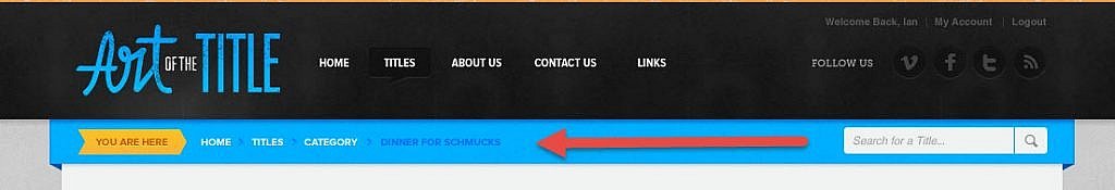 Breadcrumb-Navigation (Source: Carl DeCaire on Dribbble)[/caption]
With that, we've already traced a rather wide arc. Let's move from the general information to something more specific, and start with the basics that apply for every type of navigation.
Breadcrumb-Navigation (Source: Carl DeCaire on Dribbble)[/caption]
With that, we've already traced a rather wide arc. Let's move from the general information to something more specific, and start with the basics that apply for every type of navigation.
 Vue.js Amsterdam: the most essential menu entry is highlighted. (Screenshot: Noupe)[/caption]
Over the past years, mainly fostered by the trend towards long scrolling, so-called "fixed navigation bars" have established themselves. These are navigation bars that are released from their original position during scrolling, so they stay visible at the top of the browser window at all times. This way, orientation is not lost, even if your visitors actively move through the content.
The necessity of visibility also means that you should avoid navigation that only consists of icons at all cost. Using pictograms in addition to the text entry may be a neat idea in terms of design. However, symbols on their own are not a good choice, as they are too small and often can't be interpreted clearly enough. Stick to Steve Krug.
[caption id="attachment_103976" align="aligncenter" width="800"]
Vue.js Amsterdam: the most essential menu entry is highlighted. (Screenshot: Noupe)[/caption]
Over the past years, mainly fostered by the trend towards long scrolling, so-called "fixed navigation bars" have established themselves. These are navigation bars that are released from their original position during scrolling, so they stay visible at the top of the browser window at all times. This way, orientation is not lost, even if your visitors actively move through the content.
The necessity of visibility also means that you should avoid navigation that only consists of icons at all cost. Using pictograms in addition to the text entry may be a neat idea in terms of design. However, symbols on their own are not a good choice, as they are too small and often can't be interpreted clearly enough. Stick to Steve Krug.
[caption id="attachment_103976" align="aligncenter" width="800"] Icon Support: Neat, But Not Necessary. (Source: UI Kit by Creative Mints on Dribbble)[/caption]
Speaking of text entries: use texts that allow for precise conclusions what the user will see after clicking. In contrast to what people used to say, it is okay to choose menu items that consist of multiple words, such as "upload your image," instead of "upload."
Icon Support: Neat, But Not Necessary. (Source: UI Kit by Creative Mints on Dribbble)[/caption]
Speaking of text entries: use texts that allow for precise conclusions what the user will see after clicking. In contrast to what people used to say, it is okay to choose menu items that consist of multiple words, such as "upload your image," instead of "upload."
 A Prominent Search Field as a Central Navigation Element on Pixabay. (Screenshot: Noupe)[/caption]
Flexibility also means that your visitors should be able to move back to where they came from, wherever they are. This might not always make sense, but it does give the users the comforting feeling of ever knowing where, and how deep they are into the page web. The easiest and best way of providing this kind of orientation is the so-called breadcrumb navigation.
If you stick to these three simple rules, there is not a lot that can go wrong regarding your navigation design. Now, let's look into some details that will specifically improve your navigation.
A Prominent Search Field as a Central Navigation Element on Pixabay. (Screenshot: Noupe)[/caption]
Flexibility also means that your visitors should be able to move back to where they came from, wherever they are. This might not always make sense, but it does give the users the comforting feeling of ever knowing where, and how deep they are into the page web. The easiest and best way of providing this kind of orientation is the so-called breadcrumb navigation.
If you stick to these three simple rules, there is not a lot that can go wrong regarding your navigation design. Now, let's look into some details that will specifically improve your navigation.
 We have our doubts whether this menu contributes to clarity. (Source: Timothy Kortman on Dribbble)[/caption]
By the way, it is worth discussing if not even those large online retailers would be better off without mega menus. Most of the time, their sole purpose is the demonstration of sheer size, rather than contributing to the site's usability. Products are mostly found using the search function, or other navigation features such as bestseller lists.
We have our doubts whether this menu contributes to clarity. (Source: Timothy Kortman on Dribbble)[/caption]
By the way, it is worth discussing if not even those large online retailers would be better off without mega menus. Most of the time, their sole purpose is the demonstration of sheer size, rather than contributing to the site's usability. Products are mostly found using the search function, or other navigation features such as bestseller lists.
Breadcrumb-Navigation (Source: Carl DeCaire on Dribbble)[/caption]
With that, we've already traced a rather wide arc. Let's move from the general information to something more specific, and start with the basics that apply for every type of navigation.
Rule #1: Navigation is Consistent
Regardless of how you design your page navigation. Consistency has to be provided at all times. This means that the selected positions remain the same throughout the entire website. Even if some content on a specific subpage may be more visually appealing if the navigation wasn't at the top, but on the side instead. Don't do it. When using software, the navigation elements don't change all the time either. Only the content changes. The frame, the basic structure, is rigid. This creates safety. The safety of knowing how you can get where you want to go. Orientation and security are basic needs that we can't risk losing. Otherwise, the visitor will look for an alternative that provides that better. Consistency is not only important regarding element placement. The content mustn't switch either, and the design remains the same as well.Rule #2: Navigation is Visible
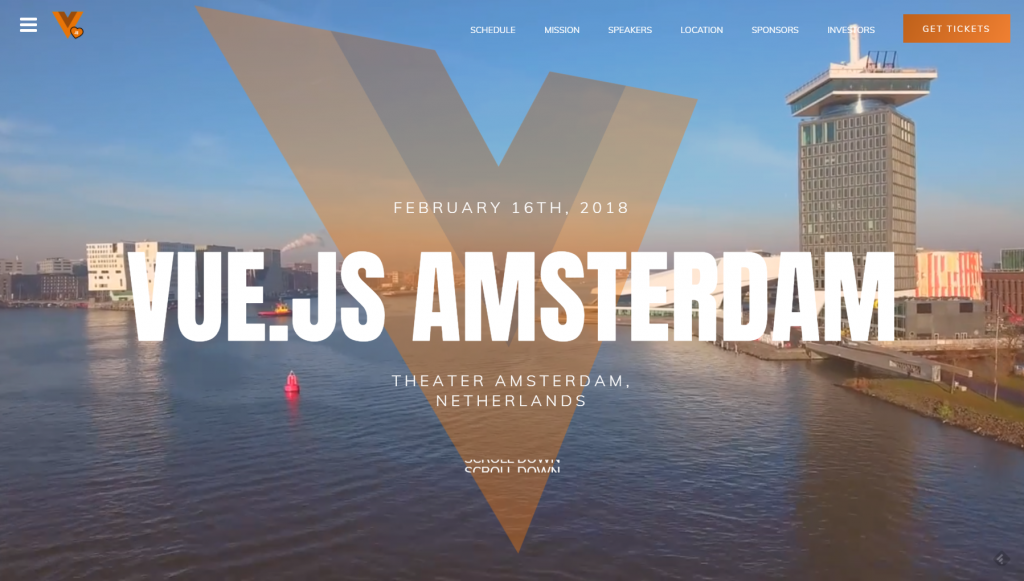
Don't try to hide the navigation to direct the focus to other page elements. The navigation is so essential that it should never be in the background. Instead, it should always be visible, which is easily done by placing it in a prominent spot and set it apart with color. Highlighting the respectively selected menu item when hovering, and maintaining said highlight when clicking, resulting in the visual impression of hitting a switch, has been proven to be a best practice. It doesn't work without any skeuomorphism after all. Make sure to have a distinct contrast between "selected" and "not selected." A switch from light to dark grey when hovering is not enough. Speaking of hover: making the clickable area larger than the actual target has been proven to be useful as well. Thus, we place an imaginary box around the navigation text and define the entire area as a click zone. This way the entry gets easier to identify and easier to hit. [caption id="attachment_103980" align="aligncenter" width="1024"] Vue.js Amsterdam: the most essential menu entry is highlighted. (Screenshot: Noupe)[/caption]
Over the past years, mainly fostered by the trend towards long scrolling, so-called "fixed navigation bars" have established themselves. These are navigation bars that are released from their original position during scrolling, so they stay visible at the top of the browser window at all times. This way, orientation is not lost, even if your visitors actively move through the content.
The necessity of visibility also means that you should avoid navigation that only consists of icons at all cost. Using pictograms in addition to the text entry may be a neat idea in terms of design. However, symbols on their own are not a good choice, as they are too small and often can't be interpreted clearly enough. Stick to Steve Krug.
[caption id="attachment_103976" align="aligncenter" width="800"] Icon Support: Neat, But Not Necessary. (Source: UI Kit by Creative Mints on Dribbble)[/caption]
Speaking of text entries: use texts that allow for precise conclusions what the user will see after clicking. In contrast to what people used to say, it is okay to choose menu items that consist of multiple words, such as "upload your image," instead of "upload."
Rule #3: Navigation is Flexible
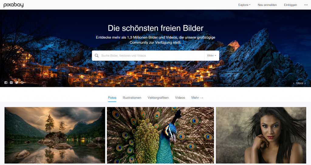
Everybody's different. Thus, it is recommended to offer more than one menu navigation. At least an additional search function has to be provided. This is one effect of the Generation Google. The search field is always used when the navigation menu doesn't immediately tell you where the desired information is hidden. By now, it's common to connect the menu and the search function, turning them into a unit, like a navigation bar. When that is fixed at the top of the page, this gives users two search methods in one spot. [caption id="attachment_103978" align="aligncenter" width="1024"] A Prominent Search Field as a Central Navigation Element on Pixabay. (Screenshot: Noupe)[/caption]
Flexibility also means that your visitors should be able to move back to where they came from, wherever they are. This might not always make sense, but it does give the users the comforting feeling of ever knowing where, and how deep they are into the page web. The easiest and best way of providing this kind of orientation is the so-called breadcrumb navigation.
If you stick to these three simple rules, there is not a lot that can go wrong regarding your navigation design. Now, let's look into some details that will specifically improve your navigation.
The Navigation Menu is Only as Elaborate as it Needs to be
Which web designer doesn't know this? The customer wants his entire website to be accessible from the menu. Everything is super important, after all. He's confusing the navigation menu with a sitemap. Don't support him on this stroll off track. The search function should allow users to find all content. The menu's job is to name the most critical areas and make them accessible. Thus, the menu is one of the first elements you should develop when it comes to a new web project. Then, use the menu to create the sitemap, which is supposed to display all branches of the site. This is not the task of the navigation menu. The more options the menu gives the visitor to choose from, the lower your influence on where he moves. As a classic website should have some conversion goal, this cannot be something you're interested in. The smaller the number of options, the safer the visitor will feel. That's because he won't be confronted with the actual amount of content when making his first decisions on the site.Wrong Track: Mega Menus
Not too long ago, we tried finding a compromise. So-called mega menus made their appearance on way too many websites. Some mega menus were a small site in themselves, hiding the actual content, and allowing users to surf that micro-site almost independently. This may seem impressive, but it only makes sense for very few websites. As long as you're not working for Amazon or another large online retailer, you should forget about this kind of menu. [caption id="attachment_103981" align="aligncenter" width="800"] We have our doubts whether this menu contributes to clarity. (Source: Timothy Kortman on Dribbble)[/caption]
By the way, it is worth discussing if not even those large online retailers would be better off without mega menus. Most of the time, their sole purpose is the demonstration of sheer size, rather than contributing to the site's usability. Products are mostly found using the search function, or other navigation features such as bestseller lists.