
Forgiveness: Your Design Has to Handle Mistakes…

Humans make mistakes, a lot of mistakes. Thus, designs of all kinds have to expect mistakes and react with forgiveness.
No matter how hard you try, you won't always be able to prevent people from making mistakes when using your designs. Let me prove this with an example.
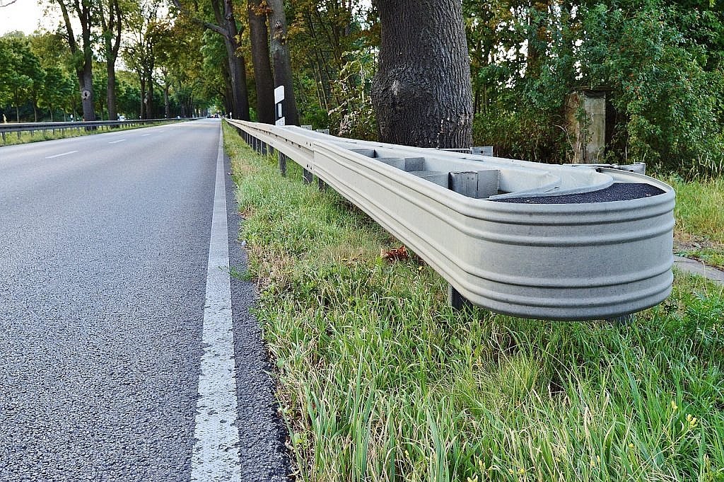 The crash barrier is a perfect example of a forgiving design element. [/caption]
(Image by Ulrich Dregler from Pixabay)
Some mistakes are so grave that we talk about human failure. Remembering two trains crashing in Bad Aibling, Bavaria two years ago.
The underlying process was obviously suffering from grave design errors. Neither a sufficient inherent control function nor sensible safety nets were provided for the case of emergency.
This example is just meant to clarify which enormous significance careful design has, and why it should definitely be forgiving. For forgiving design, there are a few tips, and while they may seem a bit retro, they never lose focus on the human.
The crash barrier is a perfect example of a forgiving design element. [/caption]
(Image by Ulrich Dregler from Pixabay)
Some mistakes are so grave that we talk about human failure. Remembering two trains crashing in Bad Aibling, Bavaria two years ago.
The underlying process was obviously suffering from grave design errors. Neither a sufficient inherent control function nor sensible safety nets were provided for the case of emergency.
This example is just meant to clarify which enormous significance careful design has, and why it should definitely be forgiving. For forgiving design, there are a few tips, and while they may seem a bit retro, they never lose focus on the human.
 You can also take affordance too far. [/caption]
(Image by Bruno /Germany from Pixabay)
The days of design with affordance being rather simple are over, though. Those were the days of skeuomorphism, where app designers tried to make digital products look as similar to their real-world counterparts as possible. As a result, we had calendar apps with a leather look and ring binding, or switches that actually looked like switches, and worked like them. From the perspective of affordance, those were the golden days.
The flat design brought a much more abstract way of design into our lives. At least, nothing here can be derived directly from our everyday life. However, the modern human has gotten so used to digital media that the new elements (also known as microinteractions) are easy for him to get used to. Just recently, I wrote this article describing why microinteractions are becoming increasingly more important.
[caption id="attachment_104251" align="aligncenter" width="1024"]
You can also take affordance too far. [/caption]
(Image by Bruno /Germany from Pixabay)
The days of design with affordance being rather simple are over, though. Those were the days of skeuomorphism, where app designers tried to make digital products look as similar to their real-world counterparts as possible. As a result, we had calendar apps with a leather look and ring binding, or switches that actually looked like switches, and worked like them. From the perspective of affordance, those were the golden days.
The flat design brought a much more abstract way of design into our lives. At least, nothing here can be derived directly from our everyday life. However, the modern human has gotten so used to digital media that the new elements (also known as microinteractions) are easy for him to get used to. Just recently, I wrote this article describing why microinteractions are becoming increasingly more important.
[caption id="attachment_104251" align="aligncenter" width="1024"] When your design is that confusing to the user, you should go back to the drawing board. [/caption]
(Image by Maddy Mazur from Pixabay)
In order to not make things harder than they have to be, designers should use established UI patterns. Examples for that could be Google's Material-Design-Guidelines, or patterns from Zurb or Bootstrap. Additionally, it is also true that modern UI elements are more like to be recognized the more they resemble everyday objects with the same function. Here, shadows, gradients, textures, and anything else that could help users relate can be useful.
In order to increase the affordance character, you should give clear names to actions, and not leave the guessing to the user. It is very important that your actions don't collide with the standard behavior of the operating system. The iPhone's swipe gestures are a very common sandtrap.
When your design is that confusing to the user, you should go back to the drawing board. [/caption]
(Image by Maddy Mazur from Pixabay)
In order to not make things harder than they have to be, designers should use established UI patterns. Examples for that could be Google's Material-Design-Guidelines, or patterns from Zurb or Bootstrap. Additionally, it is also true that modern UI elements are more like to be recognized the more they resemble everyday objects with the same function. Here, shadows, gradients, textures, and anything else that could help users relate can be useful.
In order to increase the affordance character, you should give clear names to actions, and not leave the guessing to the user. It is very important that your actions don't collide with the standard behavior of the operating system. The iPhone's swipe gestures are a very common sandtrap.
 Unsolved problem: getting the toothpaste back into the tube. [/caption]
(Image by Steve Buissinne from Pixabay)
Of course, not all actions can be absolutely reversible. Where that is not possible, forgiving design should be considered from a guidance perspective. If the user has to make an irreversible decision, slow down the interaction by breaking it down to two steps, and making the user confirm it with a "Do you really want to do this? This action can not be reverted.".
Here, it is important to give a clear label to the action, leaving no room for doubt regarding the effect of the decision.
Unsolved problem: getting the toothpaste back into the tube. [/caption]
(Image by Steve Buissinne from Pixabay)
Of course, not all actions can be absolutely reversible. Where that is not possible, forgiving design should be considered from a guidance perspective. If the user has to make an irreversible decision, slow down the interaction by breaking it down to two steps, and making the user confirm it with a "Do you really want to do this? This action can not be reverted.".
Here, it is important to give a clear label to the action, leaving no room for doubt regarding the effect of the decision.
There's No Cure for Stupidity?
A while ago, an older local lady tossed a five-figure (according to her) amount of money into a charity bin. She said she had inherited the money and had hidden it in a shoe. To top it off, she only noticed her mistake a week after she threw the shoe into the container. Is this an example of a mistake that only the affected person could have prevented? Either way, it is clear that the standard design approach won't let you get around these stupid mishaps. Would a sign at the container have helped? "Please make sure not to throw money into the charity bin"? Or should these bins basically work via double-opt-in? "You want to throw something into the container? Are you sure?" On the first attempt, the items are pushed back out of the container. They're only kept in on the second try. Hard to mimic, and surely difficult to advocate for acceptance aspects.Forgiving Design Even Works For Absurd Mistakes
Nonetheless, even here, we can still prepare our design for human mistakes. A forgiving design, which is what this article is about, could have been accomplished with the following sign: "If you have accidentally thrown something into the charity bin, please call us within two work days under the phone number 123456." This probably wouldn't have helped the lady from our example either. After all, she only noticed her mistake a couple of days later, but, in general, this kind of message could definitely be successful. Naturally, the processes behind the message need to be installed. It wouldn't help if the lady called the number, just for someone to tell her that nothing could be done about it. And, where did she even get that number from in the first place?Forgiving Design is a Mix of Guidance and Safety Web
As you can see: forgiving design is a mix of good guidance in advance, and sensible safety webs being there if need be. Imagine yourself driving in your car towards a sharp bend. How could we protect you from making mistakes? Here, it would make sense to lower the speed limit, and notifying the driver that there's a sharp curve ahead - early and multiple times. Within the curve, there should be solid crash barriers as a safety web in case the previous guidance failed. [caption id="attachment_104252" align="alignnone" width="1024"] The crash barrier is a perfect example of a forgiving design element. [/caption]
(Image by Ulrich Dregler from Pixabay)
Some mistakes are so grave that we talk about human failure. Remembering two trains crashing in Bad Aibling, Bavaria two years ago.
The underlying process was obviously suffering from grave design errors. Neither a sufficient inherent control function nor sensible safety nets were provided for the case of emergency.
This example is just meant to clarify which enormous significance careful design has, and why it should definitely be forgiving. For forgiving design, there are a few tips, and while they may seem a bit retro, they never lose focus on the human.
Tip #1 | Affordance: Design With a Prompting Touch
The best practice for forgiving design is considered working with a clear affordance. The most common example for this is a door with a handle on one side, and a mere metal plate on the other. This way, the door prompts the user to pull on one side and to push on the other. The design itself has a touch of affordance. Additional interpretations or instructions are redundant in this case, though this case is not always this simple to create. [caption id="attachment_104255" align="aligncenter" width="1024"] You can also take affordance too far. [/caption]
(Image by Bruno /Germany from Pixabay)
The days of design with affordance being rather simple are over, though. Those were the days of skeuomorphism, where app designers tried to make digital products look as similar to their real-world counterparts as possible. As a result, we had calendar apps with a leather look and ring binding, or switches that actually looked like switches, and worked like them. From the perspective of affordance, those were the golden days.
The flat design brought a much more abstract way of design into our lives. At least, nothing here can be derived directly from our everyday life. However, the modern human has gotten so used to digital media that the new elements (also known as microinteractions) are easy for him to get used to. Just recently, I wrote this article describing why microinteractions are becoming increasingly more important.
[caption id="attachment_104251" align="aligncenter" width="1024"] When your design is that confusing to the user, you should go back to the drawing board. [/caption]
(Image by Maddy Mazur from Pixabay)
In order to not make things harder than they have to be, designers should use established UI patterns. Examples for that could be Google's Material-Design-Guidelines, or patterns from Zurb or Bootstrap. Additionally, it is also true that modern UI elements are more like to be recognized the more they resemble everyday objects with the same function. Here, shadows, gradients, textures, and anything else that could help users relate can be useful.
In order to increase the affordance character, you should give clear names to actions, and not leave the guessing to the user. It is very important that your actions don't collide with the standard behavior of the operating system. The iPhone's swipe gestures are a very common sandtrap.
Tip #2 | Allow Users to Revert Accidental Actions
You know this from the Office applications, as well as Photoshop. How often have you removed accidental Photoshop steps? This special form of forgiving design is the best safety web you could integrate. If nothing is final, the user will have an easy time getting used to your control concept. [caption id="attachment_104253" align="aligncenter" width="1024"] Unsolved problem: getting the toothpaste back into the tube. [/caption]
(Image by Steve Buissinne from Pixabay)
Of course, not all actions can be absolutely reversible. Where that is not possible, forgiving design should be considered from a guidance perspective. If the user has to make an irreversible decision, slow down the interaction by breaking it down to two steps, and making the user confirm it with a "Do you really want to do this? This action can not be reverted.".
Here, it is important to give a clear label to the action, leaving no room for doubt regarding the effect of the decision.
Tip #3 | Make Use of Help, Warnings, and Input Prompts
You know this from forms. A mandatory field was left out. The JavaScript tells the user that the field X needs to be filled before the form can be sent out. This warning helps the user to succeed in the end. The mistake has been made. The design forgives and guides the user in the right direction. You should offer help for anything that could be even slightly complicated or irreversible. They should explain what can be accomplished, and how to do so. However, they should not be needed to explain the meaning of the labels on the buttons. Input prompts are a perfect choice to be used as a decelerator.As mentioned above, it makes sense to slow down the interaction when it comes to irreversible decisions. This raises the user's awareness levels. The chances of the fast default-okay are reduced. Conclusion: Forgiving Design is Not as Hard as You May Have Thought Users of your design not making any mistakes is a utopic fantasy. Even if you think you have created a very simple process with no room for error, your users will definitely prove you wrong in no time. Thus, it is important to expect mistakes from the very beginning, and, if they're predictable, to prepare the design for them. You've learned the most important tips today. Make sure to identify and prevent as many possible mistakes as possible during the design process. Software developers are experts in that department. Maybe, you could link up with someone from that branch and discuss mistakes and how to avoid them. This will also help you as a web or product designer. Other Sources- The Term Affordance in UI-Design | Philipp Holzer
- Designing for Forgiveness | Jules Cheung
- Design principle: Error & Forgiveness | Anton Nikolov
- Principles of Design: Forgiveness | Adam McGee