
Showcase of Energetic Film Websites
Who doesn't like a good movie? Virtually every movie made has a film website these days, ranging from little more than an online place to park a trailer to a fully-immersive experience. And with the varied content, themes, and visual style of movies out there, it's no wonder that film websites are just as varied.
[fblike]
Below are more than forty excellent examples of film websites, broken down by style, content, and features. We've also included some dos and don'ts for this type of site. If you have other favorite film websites, please share them in the comments below!
 Rango
The Rango site is simple, with an animated background and what looks like a rustic, home-made movie screen, with the trailer video playing on top of it. It's simple, but gives a good sense of the feel of the movie. If you close out of the trailer, there is some other interactive content, but it currently doesn't do anything other than some animations and sound effects:
Rango
The Rango site is simple, with an animated background and what looks like a rustic, home-made movie screen, with the trailer video playing on top of it. It's simple, but gives a good sense of the feel of the movie. If you close out of the trailer, there is some other interactive content, but it currently doesn't do anything other than some animations and sound effects:
 Gnomeo & Juliet
The Gnomeo & Juliet site starts with a brief Flash intro, and then the focus is squarely on the trailer. The only other content on the page is an option to share or like the page on Facebook:
Gnomeo & Juliet
The Gnomeo & Juliet site starts with a brief Flash intro, and then the focus is squarely on the trailer. The only other content on the page is an option to share or like the page on Facebook:
 Super 8
Leave it to J.J. Abrams to create a site that has minimal content (just a trailer and some sharing options) and yet can generate such interest for an upcoming film. It's proof that film websites don't need to be complicated to be effective:
Super 8
Leave it to J.J. Abrams to create a site that has minimal content (just a trailer and some sharing options) and yet can generate such interest for an upcoming film. It's proof that film websites don't need to be complicated to be effective:
 Skyline
The website for Skyline is visually beautiful and includes an interactive feature that lets visitors upload an image of themselves to see what they'd look like under alien control:
Skyline
The website for Skyline is visually beautiful and includes an interactive feature that lets visitors upload an image of themselves to see what they'd look like under alien control:
 Accidents Happen
Having scenes from the film play in the background on the Accidents Happen site is something that isn't often seen and really makes the site stand out:
Accidents Happen
Having scenes from the film play in the background on the Accidents Happen site is something that isn't often seen and really makes the site stand out:
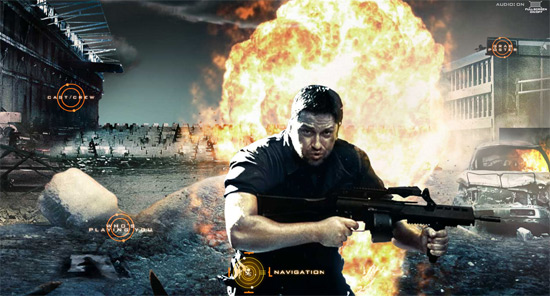
 Gamer
The Gamer website evokes the feel of the movie perfectly, and offers visitors the chance to control a slayer. The navigation takes a bit of getting used to, since the screen moves around dependent on your mouse movements:
Gamer
The Gamer website evokes the feel of the movie perfectly, and offers visitors the chance to control a slayer. The navigation takes a bit of getting used to, since the screen moves around dependent on your mouse movements:
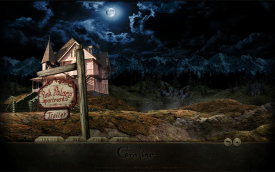
 Coraline
The Coraline site is wonderfully dark and has a great 3D effect. The look and feel of the site really evoke the movie:
Coraline
The Coraline site is wonderfully dark and has a great 3D effect. The look and feel of the site really evoke the movie:
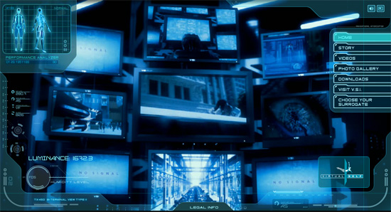
 Surrogates
Websites that really evoke the themes or elements of a film are way more engaging than their counterparts that only offer a trailer and some stills. The Surrogates website includes a link to Virtual Self Industries, giving the story a touch of added realism:
Surrogates
Websites that really evoke the themes or elements of a film are way more engaging than their counterparts that only offer a trailer and some stills. The Surrogates website includes a link to Virtual Self Industries, giving the story a touch of added realism:
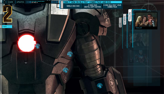
 Iron Man 2
The Iron Man 2 website immerses visitors in the world of the film via graphics and interactivity that are reminiscent of elements within the movie:
Iron Man 2
The Iron Man 2 website immerses visitors in the world of the film via graphics and interactivity that are reminiscent of elements within the movie:
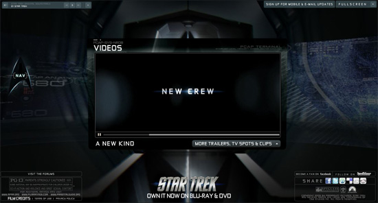
 Star Trek
The Star Trek site uses a 3D walk-through of the ship for navigation, with fantastic transparent elements and a style that's reminiscent of the computer consoles in the film:
Star Trek
The Star Trek site uses a 3D walk-through of the ship for navigation, with fantastic transparent elements and a style that's reminiscent of the computer consoles in the film:
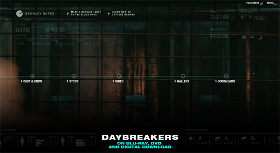
 Daybreakers
The Daybreakers website plays clips from the movie in the background, immersing visitors in the look and feel of the film:
Daybreakers
The Daybreakers website plays clips from the movie in the background, immersing visitors in the look and feel of the film:
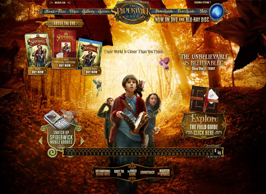
 The Spiderwick Chronicles
Offering content straight out of the movie is a fantastic way to engage visitors, especially young ones. The Spiderwick Chronicles site lets visitors look at the Field Guide featured in the movie, which is a great way to draw users in, as is the "Create Your Own Field Guide" feature:
The Spiderwick Chronicles
Offering content straight out of the movie is a fantastic way to engage visitors, especially young ones. The Spiderwick Chronicles site lets visitors look at the Field Guide featured in the movie, which is a great way to draw users in, as is the "Create Your Own Field Guide" feature:
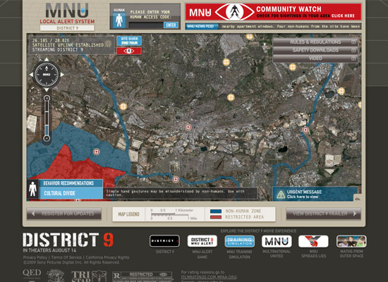
 District 9
The District 9 website plays on the themes of the movie by looking like a map of the city, with the restricted area highlighted:
District 9
The District 9 website plays on the themes of the movie by looking like a map of the city, with the restricted area highlighted:
 Alice in Wonderland
The website for Tim Burton's version of Alice in Wonderland has a fantastic visual style that fits perfectly with the look of the movie. Plenty of extra features, including a gallery, downloads and music are all included:
Alice in Wonderland
The website for Tim Burton's version of Alice in Wonderland has a fantastic visual style that fits perfectly with the look of the movie. Plenty of extra features, including a gallery, downloads and music are all included:
 Avatar
's website is almost as spectacular, visually, as the film itself was. There's tons of extra content here, including and Pandora Desktop app, immersive video, an app to turn yourself into an Avatar, and more. The layout of the site is simple, with a scrolling horizontal nav bar along the bottom and a slideshow of images from the movie in the background:
Avatar
Avatar's website is almost as spectacular, visually, as the film itself was. There's tons of extra content here, including and Pandora Desktop app, immersive video, an app to turn yourself into an Avatar, and more. The layout of the site is simple, with a scrolling horizontal nav bar along the bottom and a slideshow of images from the movie in the background:
 Cloudy with a Chance of Meatballs
The website for Cloudy with a Chance of Meatballs is fun and cheerful, just like the movie. It's clearly aimed at kids, and includes games, downloads, music, and more:
Cloudy with a Chance of Meatballs
The website for Cloudy with a Chance of Meatballs is fun and cheerful, just like the movie. It's clearly aimed at kids, and includes games, downloads, music, and more:
 Lemony Snicket's A Series of Unfortunate Events
The Lemony Snicket site has fantastic, fully-animated navigation. Bonus content, including games and downloads, is also offered:
Lemony Snicket's A Series of Unfortunate Events
The Lemony Snicket site has fantastic, fully-animated navigation. Bonus content, including games and downloads, is also offered:
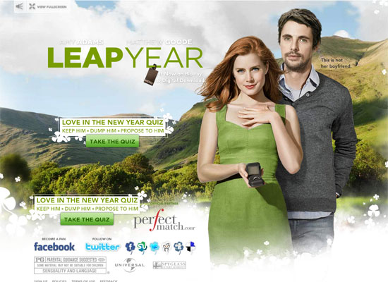
 Leap Year
The Leap Year website offers interactive content (a quiz), which is not often seen in this genre of film. The design of the site is simple, with emphasis on the film's stars:
Leap Year
The Leap Year website offers interactive content (a quiz), which is not often seen in this genre of film. The design of the site is simple, with emphasis on the film's stars:
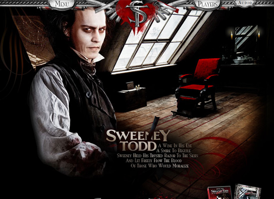
 Sweeney Todd
The Sweeney Todd official site has a fantastic black and red color scheme and gritty look that evokes the feel of the film. The "Cut Your Own Trailer" feature is a great way to get fans involved:
Sweeney Todd
The Sweeney Todd official site has a fantastic black and red color scheme and gritty look that evokes the feel of the film. The "Cut Your Own Trailer" feature is a great way to get fans involved:
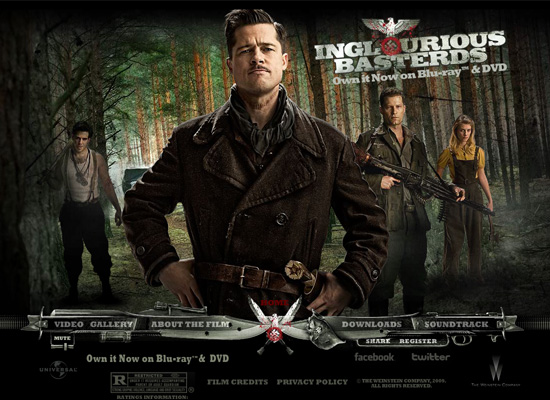
 Inglourious Basterds
 is another site that puts their biggest star front-and-center, this time Brad Pitt. The subtle animations on the site are also a great touch:
Inglourious Basterds
Inglourious Basterds is another site that puts their biggest star front-and-center, this time Brad Pitt. The subtle animations on the site are also a great touch:
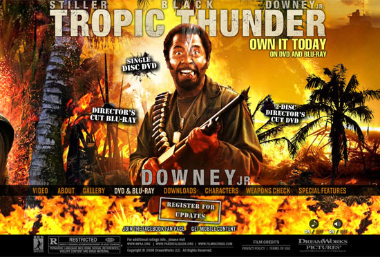
 Tropic Thunder
The Tropic Thunder site uses the characters as part of the navigation, and uses interactive content (like the Weapons Check game) to engage visitors with the site:
Tropic Thunder
The Tropic Thunder site uses the characters as part of the navigation, and uses interactive content (like the Weapons Check game) to engage visitors with the site:
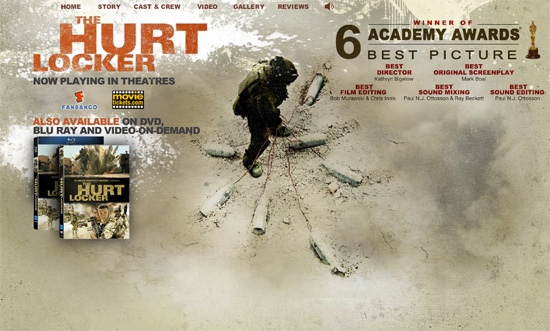
 The Hurt Locker
 is another site where awards are given prominence on the homepage. This is especially popular on sites that have won major awards, such as the Academy Award for Best Picture:
The Hurt Locker
The Hurt Locker is another site where awards are given prominence on the homepage. This is especially popular on sites that have won major awards, such as the Academy Award for Best Picture:
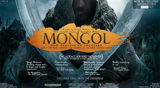
 Mongol
The Mongol site is another that showcases award nominations on the homepage, alongside positive reviews. The rest of the site is very simple, with downloads, video content, and e-cards:
Mongol
The Mongol site is another that showcases award nominations on the homepage, alongside positive reviews. The rest of the site is very simple, with downloads, video content, and e-cards:
 Sanctum
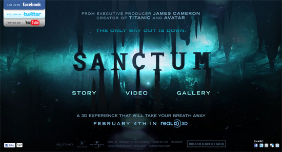
The site for Sanctum is fairly minimal, with a Flash interface and three pages: "Story", "Video", and "Gallery". The UI is slick and works seamlessly, offering a great user experience. The only thing out of place here is the social media links in the upper left, which don't really fit in with the aesthetics of the rest of the site:
Sanctum
The site for Sanctum is fairly minimal, with a Flash interface and three pages: "Story", "Video", and "Gallery". The UI is slick and works seamlessly, offering a great user experience. The only thing out of place here is the social media links in the upper left, which don't really fit in with the aesthetics of the rest of the site:
 Charlie and the Chocolate Factory
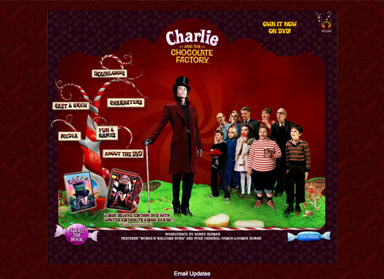
A movie website should always evoke the feel of the movie itself, and the site for Charlie and the Chocolate Factory does just that, with a whimsical design and color scheme:
Charlie and the Chocolate Factory
A movie website should always evoke the feel of the movie itself, and the site for Charlie and the Chocolate Factory does just that, with a whimsical design and color scheme:
 Paper Man
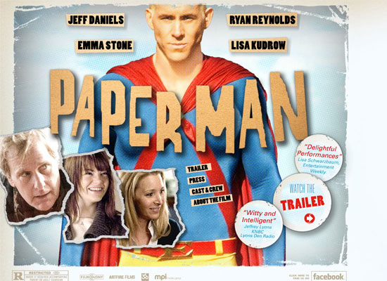
The Paper Man website is very simple, with a comic-book look that fits with the feel and theme of the movie. They put the trailer link and reviews prominently on the home page:
Paper Man
The Paper Man website is very simple, with a comic-book look that fits with the feel and theme of the movie. They put the trailer link and reviews prominently on the home page:
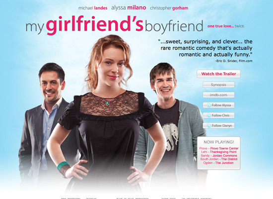
 My Girlfriend's Boyfriend
Here's a simple site that includes all the relevant information a film site needs. There's a section for where the film is playing, you can watch the trailer, follow the stars on Twitter, and view information about the film on IMDB:
My Girlfriend's Boyfriend
Here's a simple site that includes all the relevant information a film site needs. There's a section for where the film is playing, you can watch the trailer, follow the stars on Twitter, and view information about the film on IMDB:
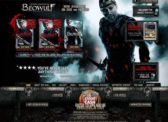
 Beowulf
The Beowulf site is a bit different in that it uses horizontal scrolling rather than new pages or vertical scrolling:
Beowulf
The Beowulf site is a bit different in that it uses horizontal scrolling rather than new pages or vertical scrolling:
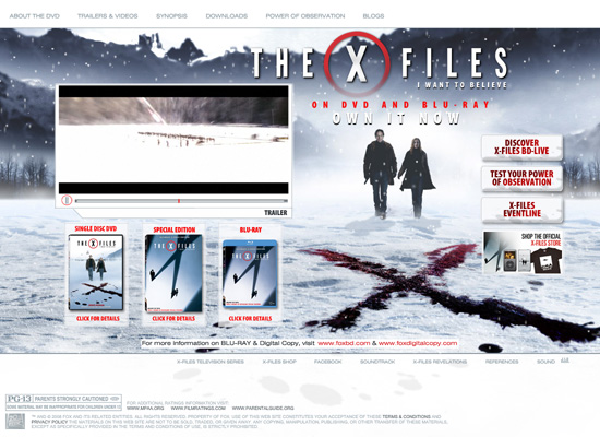
 The X-Files: I Want to Believe
 website is simpler than many film sites, with an animated background and links to the trailer and videos, downloads, and synopsis, and other content. Visually, it's a very minimalist site, with clean typography and navigation:
The X-Files: I Want to Believe
The X-Files: I Want to Believe website is simpler than many film sites, with an animated background and links to the trailer and videos, downloads, and synopsis, and other content. Visually, it's a very minimalist site, with clean typography and navigation:
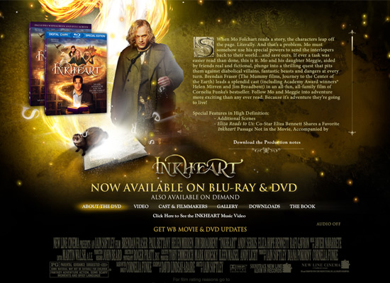
 Inkheart
The Inkheart website includes information about the movie, video content, a still gallery, downloads and more, all in a visual style that evokes the style of the film:
Inkheart
The Inkheart website includes information about the movie, video content, a still gallery, downloads and more, all in a visual style that evokes the style of the film:
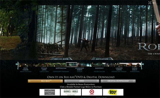
 Robin Hood
The Robin Hood website is another that uses horizontal scrolling, with images from the movie serving as the background for different sections of the site:
Robin Hood
The Robin Hood website is another that uses horizontal scrolling, with images from the movie serving as the background for different sections of the site:
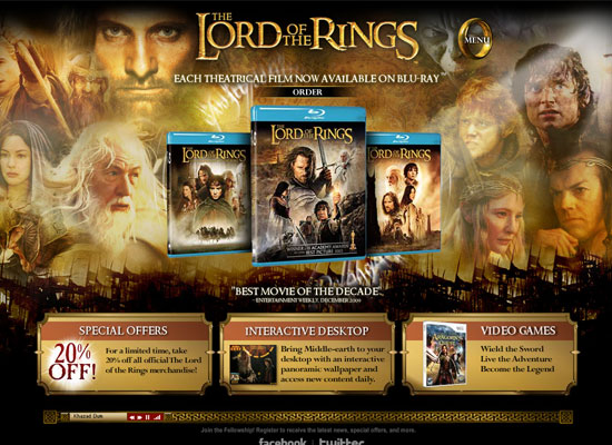
 Lord of the Rings
Sites for movie trilogies or series pose additional design problems, as it's important not to give away plot points from the later movies in the imagery, while still representing all the films in the series. The Lord of the Rings site does this beautifully. They also include extras like an interactive desktop download and information about related video games:
Lord of the Rings
Sites for movie trilogies or series pose additional design problems, as it's important not to give away plot points from the later movies in the imagery, while still representing all the films in the series. The Lord of the Rings site does this beautifully. They also include extras like an interactive desktop download and information about related video games:
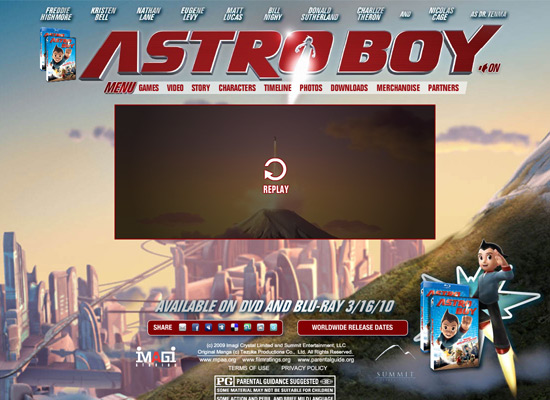
 Astro Boy
The Astro Boy website starts out with an animated intro and short trailer before the rest of the site's content loads. There's plenty of content, though, including downloads, photos and links to merchandise:
Astro Boy
The Astro Boy website starts out with an animated intro and short trailer before the rest of the site's content loads. There's plenty of content, though, including downloads, photos and links to merchandise:
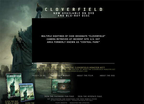
 Cloverfield
The Cloverfield website puts the focus primarily on the trailer, though they do offer a widget you can put on your own site and links to purchase the DVD. The visual style meshes perfectly with the film:
Cloverfield
The Cloverfield website puts the focus primarily on the trailer, though they do offer a widget you can put on your own site and links to purchase the DVD. The visual style meshes perfectly with the film:
Sites Not Using Flash
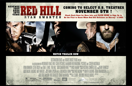
At the moment, virtually all movie and film websites are using at least some Flash — either for video content or their entire UI. The lone exception we found is below. Of course, expect to see more non-Flash movie websites as HTML5 becomes more widely adopted, especially considering the lack of Flash support on iOS. Red Hill The Red Hill site uses no animation on the homepage, and the trailer page uses QuickTime rather than Flash:
Trailer-Only Sites
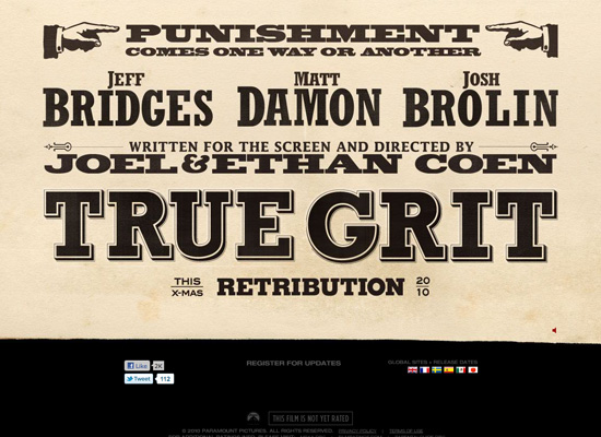
This is a particularly popular site style for upcoming films that don't have much content yet. It's not often seen on film sites once the film has been released. True Grit The True Grit website at first resembles a vintage, old-west poster. Click anywhere on the page, though, and a video window showing the two trailers pops up. It's simple, but effective:
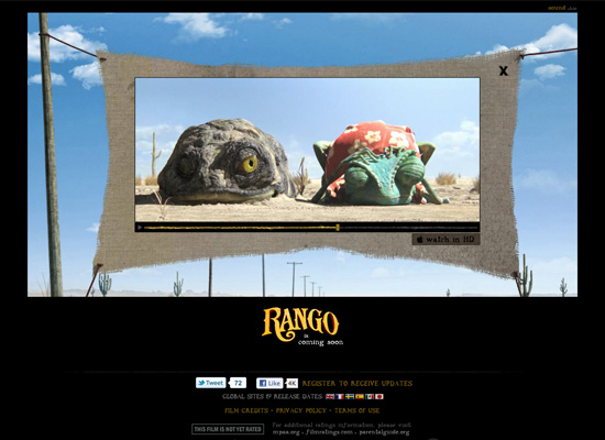
Rango
The Rango site is simple, with an animated background and what looks like a rustic, home-made movie screen, with the trailer video playing on top of it. It's simple, but gives a good sense of the feel of the movie. If you close out of the trailer, there is some other interactive content, but it currently doesn't do anything other than some animations and sound effects:
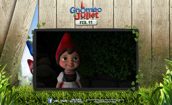
Gnomeo & Juliet
The Gnomeo & Juliet site starts with a brief Flash intro, and then the focus is squarely on the trailer. The only other content on the page is an option to share or like the page on Facebook:
Super 8
Leave it to J.J. Abrams to create a site that has minimal content (just a trailer and some sharing options) and yet can generate such interest for an upcoming film. It's proof that film websites don't need to be complicated to be effective:
Immersive Sites
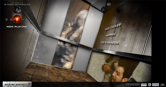
Complete immersion in the world of the film is the ultimate goal of most of these sites. Some include interactive content taken right from the film itself, while others go so far as to link to sites that appear to belong to companies featured in the film itself. Devil The website for M.Night Shyamalan's Devil is captivating. It puts you into the action of the movie in a way that's engrossing and encourages you to spend more time on the site:
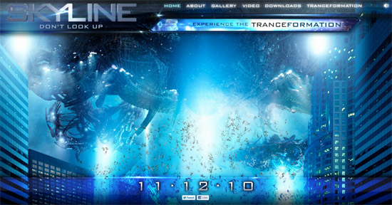
Skyline
The website for Skyline is visually beautiful and includes an interactive feature that lets visitors upload an image of themselves to see what they'd look like under alien control:
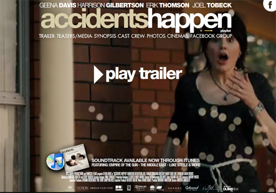
Accidents Happen
Having scenes from the film play in the background on the Accidents Happen site is something that isn't often seen and really makes the site stand out:
Gamer
The Gamer website evokes the feel of the movie perfectly, and offers visitors the chance to control a slayer. The navigation takes a bit of getting used to, since the screen moves around dependent on your mouse movements:
Coraline
The Coraline site is wonderfully dark and has a great 3D effect. The look and feel of the site really evoke the movie:
Surrogates
Websites that really evoke the themes or elements of a film are way more engaging than their counterparts that only offer a trailer and some stills. The Surrogates website includes a link to Virtual Self Industries, giving the story a touch of added realism:
Iron Man 2
The Iron Man 2 website immerses visitors in the world of the film via graphics and interactivity that are reminiscent of elements within the movie:
Star Trek
The Star Trek site uses a 3D walk-through of the ship for navigation, with fantastic transparent elements and a style that's reminiscent of the computer consoles in the film:
Daybreakers
The Daybreakers website plays clips from the movie in the background, immersing visitors in the look and feel of the film:
The Spiderwick Chronicles
Offering content straight out of the movie is a fantastic way to engage visitors, especially young ones. The Spiderwick Chronicles site lets visitors look at the Field Guide featured in the movie, which is a great way to draw users in, as is the "Create Your Own Field Guide" feature:
District 9
The District 9 website plays on the themes of the movie by looking like a map of the city, with the restricted area highlighted:
Sites With Extra Content
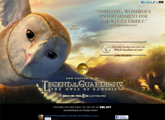
Extra content, like games, downloads, or music, are a great way to keep visitors coming back to your site. These sites all include bonus content, from interactive desktop downloads to interactive games. Legend of the Guardians The Legend of the Guardians website is perfectly suited to the target audience. The inclusion of an interactive game on the site increases the likelihood that visitors will spend more time on the site, and that they'll come back in the future:
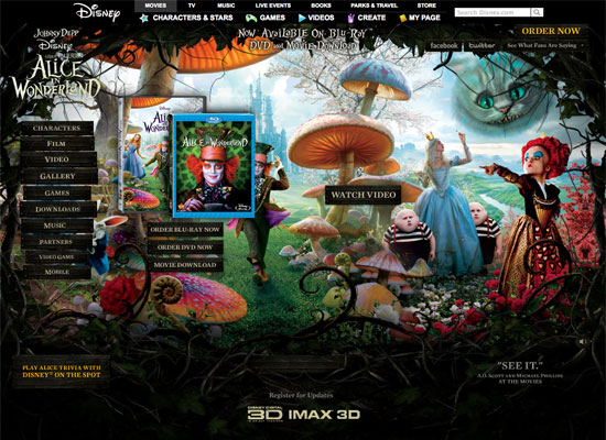
Alice in Wonderland
The website for Tim Burton's version of Alice in Wonderland has a fantastic visual style that fits perfectly with the look of the movie. Plenty of extra features, including a gallery, downloads and music are all included:
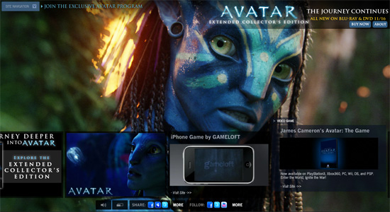
Avatar
Avatar's website is almost as spectacular, visually, as the film itself was. There's tons of extra content here, including and Pandora Desktop app, immersive video, an app to turn yourself into an Avatar, and more. The layout of the site is simple, with a scrolling horizontal nav bar along the bottom and a slideshow of images from the movie in the background:
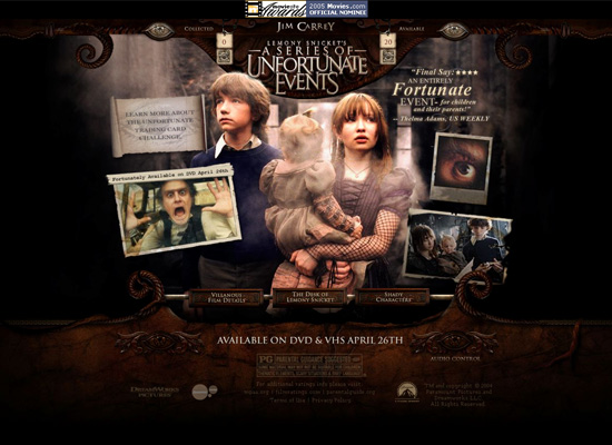
Lemony Snicket's A Series of Unfortunate Events
The Lemony Snicket site has fantastic, fully-animated navigation. Bonus content, including games and downloads, is also offered:
Leap Year
The Leap Year website offers interactive content (a quiz), which is not often seen in this genre of film. The design of the site is simple, with emphasis on the film's stars:
Sweeney Todd
The Sweeney Todd official site has a fantastic black and red color scheme and gritty look that evokes the feel of the film. The "Cut Your Own Trailer" feature is a great way to get fans involved:
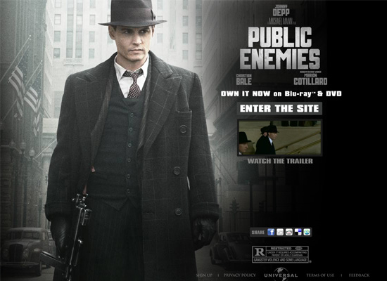
Celebrity-Focused
If your film has big-name stars, it only makes sense to feature them prominently on your film's website. That's just the strategy these designers have taken. Public Enemies Putting your big-name stars front-and-center is a great way for a movie website to generate more interest, as the Public Enemies site does with Johnny Depp:
Inglourious Basterds
Inglourious Basterds is another site that puts their biggest star front-and-center, this time Brad Pitt. The subtle animations on the site are also a great touch:
Tropic Thunder
The Tropic Thunder site uses the characters as part of the navigation, and uses interactive content (like the Weapons Check game) to engage visitors with the site:
Prominent Award Placement
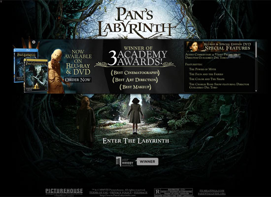
Winning or being nominated for a big award lends credibility to your film, so it makes sense to feature that information prominently on the film's website. This is seen most often with Oscar winners and nominees. Pan's Labyrinth Showcasing awards and distinctions prominently on the homepage is an excellent strategy for an independent movie site:
The Hurt Locker
The Hurt Locker is another site where awards are given prominence on the homepage. This is especially popular on sites that have won major awards, such as the Academy Award for Best Picture:
Mongol
The Mongol site is another that showcases award nominations on the homepage, alongside positive reviews. The rest of the site is very simple, with downloads, video content, and e-cards:
Other Film Sites
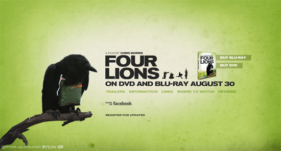
Some sites take a different approach entirely. Maybe they go a bit more minimalist, or fit more into what most would consider a "traditional" film website. But they all do an excellent job of representing the films they promote. Four Lions The Four Lions site is simple, with a crow animation and links to watch the trailers, find out more about the film (including where to watch it and reviews) and options to share it on Facebook or sign up for updates. Everything is displayed on the homepage, with sliders to show new content:
Sanctum
The site for Sanctum is fairly minimal, with a Flash interface and three pages: "Story", "Video", and "Gallery". The UI is slick and works seamlessly, offering a great user experience. The only thing out of place here is the social media links in the upper left, which don't really fit in with the aesthetics of the rest of the site:
Charlie and the Chocolate Factory
A movie website should always evoke the feel of the movie itself, and the site for Charlie and the Chocolate Factory does just that, with a whimsical design and color scheme:
Paper Man
The Paper Man website is very simple, with a comic-book look that fits with the feel and theme of the movie. They put the trailer link and reviews prominently on the home page:
My Girlfriend's Boyfriend
Here's a simple site that includes all the relevant information a film site needs. There's a section for where the film is playing, you can watch the trailer, follow the stars on Twitter, and view information about the film on IMDB:
Beowulf
The Beowulf site is a bit different in that it uses horizontal scrolling rather than new pages or vertical scrolling:
The X-Files: I Want to Believe
The X-Files: I Want to Believe website is simpler than many film sites, with an animated background and links to the trailer and videos, downloads, and synopsis, and other content. Visually, it's a very minimalist site, with clean typography and navigation:
Inkheart
The Inkheart website includes information about the movie, video content, a still gallery, downloads and more, all in a visual style that evokes the style of the film:
Robin Hood
The Robin Hood website is another that uses horizontal scrolling, with images from the movie serving as the background for different sections of the site:
Lord of the Rings
Sites for movie trilogies or series pose additional design problems, as it's important not to give away plot points from the later movies in the imagery, while still representing all the films in the series. The Lord of the Rings site does this beautifully. They also include extras like an interactive desktop download and information about related video games:
Astro Boy
The Astro Boy website starts out with an animated intro and short trailer before the rest of the site's content loads. There's plenty of content, though, including downloads, photos and links to merchandise:
Cloverfield
The Cloverfield website puts the focus primarily on the trailer, though they do offer a widget you can put on your own site and links to purchase the DVD. The visual style meshes perfectly with the film:
Film Website Best Practices
Here are some guidelines to keep in mind when developing your own film websites. Feel free to offer more in the comments!- Do evoke the style and feel of the film being marketed.
- Don't forget to give visitors the option to turn the sound off on your site. Film sites are one of the few places you can get away with autoplaying sound, but it's still important to give users control.
- Don't resize browser windows or automatically go into full-screen mode when visitors land on your site. Remember, your site might not be their primary focus at that time, and if you force it on them, they might just walk away.
- Do provide extra content from the film to engage visitors. This is especially important for children's films.
- Do feature any big-name stars prominently on the site.
- Don't be afraid to try new or experimental UI ideas if they work well for the film. But make sure they're relevant to the film and will add to the user experience.
Wow. Nice collection. Thank you.
that’s awesome, great collection listed here. thanks for sharing
Very nice and inspirational showcase of Film Websites.. thanks for sharing.
film websites have a league of their own they are always so much different from ordinary websites.
Very nice! This is a great collection that is full of design inspirations.
Thanks!
Geoff
Great selection, just done something similar on our blog with top websites of 2010. Not quite as good as this one though. Great work
Very nice collection and very inspiring.
Thank you.
its awesome thanks.
It’s obvious html5 will never be able to properly replace flashsites when it comes to microsites for movies/games/advertising campaigns.
I admit I’m a bit disappointed. Although html5 will be a great addition for the currently typical html/php/js websites, it’s never gonna be able to approach flash interactivity, animation and general lively feeling.
I just wish Apple would stop being so childish and allow users to choose for themselves.
HTML5 is the way forward, an is good to see there are a lot of sites out there that are taking that step forward…
A great collection here…
Thank you for sharing.