Showcase of City Tourism Website Designs
Tourism websites can be a tricky beast. For some areas, where there are very specific attractions, designing their site can be simple. But for areas that have a host of attractions that appeal to many different kinds of people, it can be difficult to design a site that's representative of the area and appeals to everyone. After all, designing a site that appeals to wine lovers, ski buffs, culture fanatics and families isn't exactly straightforward.
Below we've collected more than thirty excellent examples of tourism sites. First are tourism sites for cities all over the world. Then we've featured sites for states, provinces, and countries. And finally we have regional tourism sites.
City tourism sites should reflect the cities the represent. They need to appeal to the variety of people who might be interested in visiting the city, and often provide vast amounts of information.
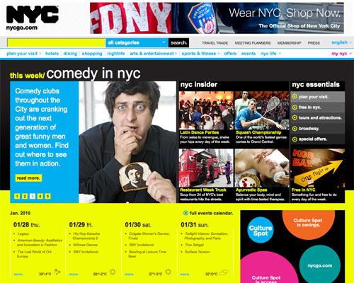 The NYCGO site makes use of vibrant colors and a grid-based layout.
London
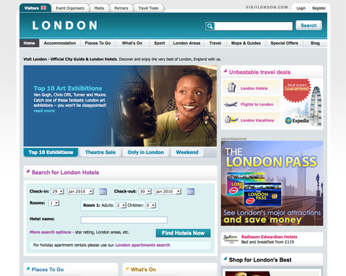 London's site is more subdued and uses a variety of shades of blue and gray in its design.
Kansas City (Kansas, USA)
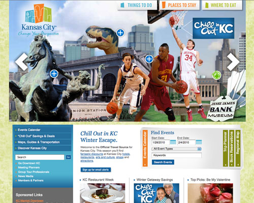 The Kansas City tourism website has a vibrant color scheme of orange, blue, and lime green, as well as a striking header and simple navigation.
Baltimore (Maryland, USA)
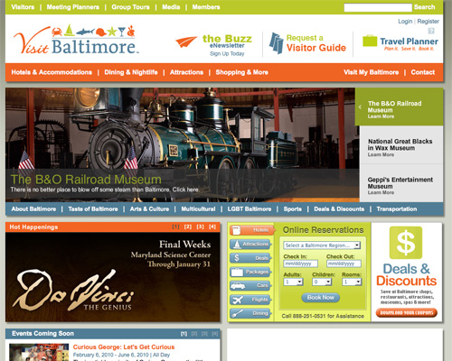 Baltimore's tourism website also makes use of a blue, orange, and green color scheme, though the layout is entirely different.
New Orleans (Louisiana, USA)
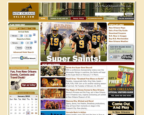 The New Orleans Online site uses a dark, muted color scheme paired with a white content background and tan overall background. The site feels a bit crowded, but is still easy to use and navigate.
Philadelphia (Pennsylvania, USA)
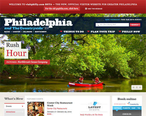 Philadelphia's official tourism site makes use of a slideshow that showcases the city's attractions and accomodations over much of the home page. In fact, on a widescreen monitor it may be the only thing you see when you first visit the page. But the effect is stunning and really makes the site stand out.
Ocean City (Maryland, USA)
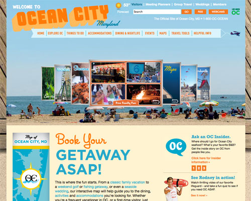 Ocean City, Maryland's site has a very beachy feel to it—perfectly appropriate for this particular city. The use of and orange, blue and off-white color scheme adds to the summery feeling.
Vancouver (British Columbia, Canada)
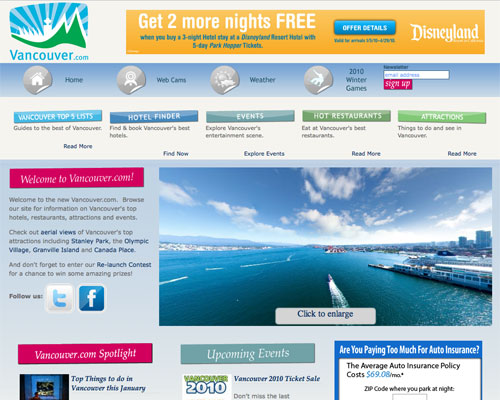 Vancouver's site uses a mostly blue and gray color scheme with bright accent colors. The also include social media links (Twitter and Facebook) right on the home page, a trend more city tourism sites are adopting.
San Antonio (Texas, USA)
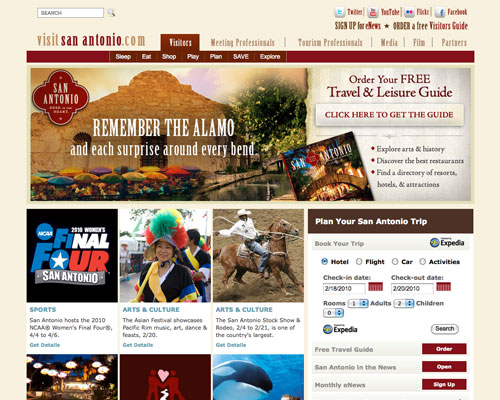 San Antonio's official tourism site has a muted tan, brown and maroon color scheme that adds to its "Old West"/Southwest feeling. The addition of some subtle grunge elements further enhances the effect.
Saint John (New Brunswick, Canada)
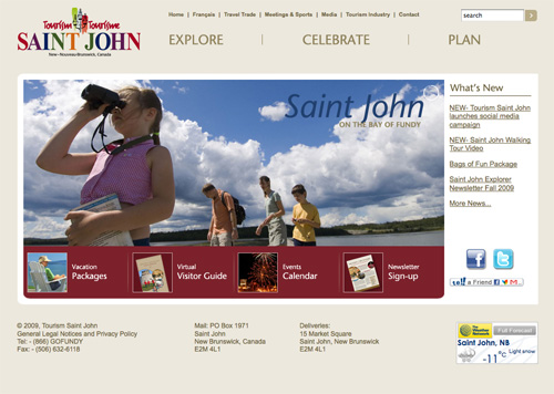 Saint John's tourism website has a very simple, almost minimalist home page that makes good use of color. It includes a slideshow showcasing the city's attractions, as well as links to social media (Facebook and Twitter).
Denver (Colorado, USA)
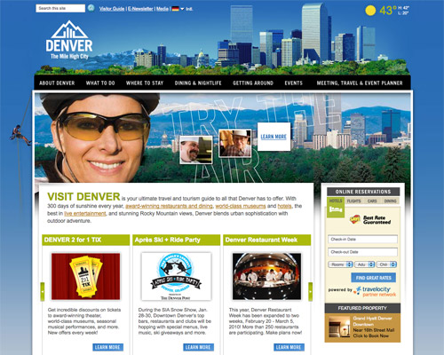 Denver's site uses an interesting header and background image. The use of bright green accents throughout the design lend the site a more modern feeling, while also echoing the city's outdoor recreation opportunities.
Boston (Massachusetts, USA)
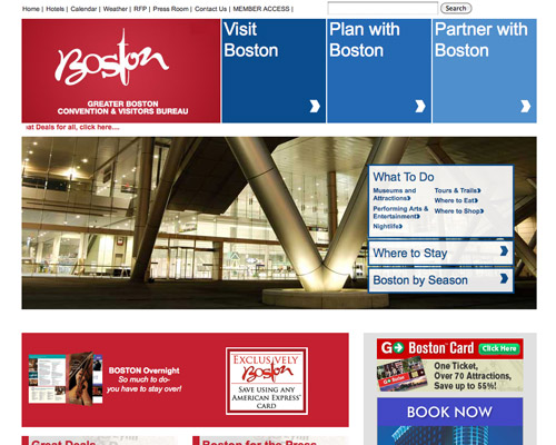 Boston's tourism site uses a red, white and blue grid layout, with a slideshow behind the main navigation.
Los Angeles (California, USA)
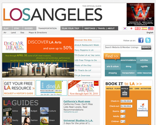 The Los Angeles tourism website has a clean, modern design and layout. It uses bright colors against a white background and multiple content areas, as well as tabbed top navigation.
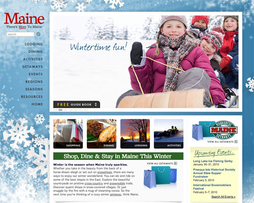 Maine's tourism website changes with the seasons (it's currently blue with a snowy motif), uses simple, vertical navigation and a slideshow of attractions.
Virginia (USA)
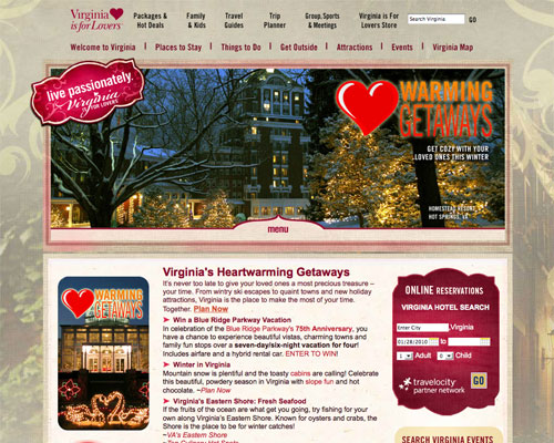 The official Virginia tourism site has an elegant, slightly old-world feeling to it. The burgundy accent colors hint at Virginia's burgeoning wine industry, and the whole thing evokes a feel of southern hospitality.
California (USA)
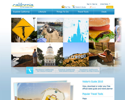 California's website has a very interesting slideshow-type navigation on their home page with is a pleasure to use. The site feels fresh while still maintaining a very neutral appearance that should appeal to a wide range of visitors.
Spain
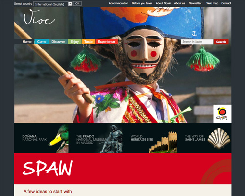 Spain's tourism website makes use of bright colors and multiple navigation areas.
Sweden
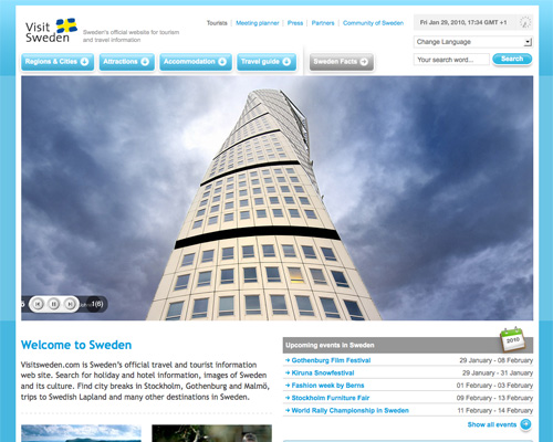 Sweden's website has a great layout and clean blue, white, and gray color scheme. They use a large header image to immediately capture your attention, and drop-down navigation leaves the page looking uncluttered.
Washington (USA)
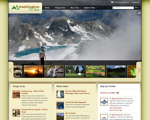 A gorgeous slideshow is the primary focus of the home page for Washington State's tourism website. The subtle, natural-toned color scheme is sure to appeal to nature-lovers, which is what the site seems to focus most heavily on.
Bermuda
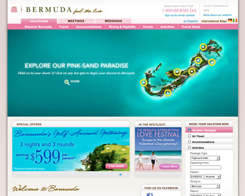 Bermuda's unexpected color choice—pink—sets this apart from other tourism sites. The overall layout is inviting and features a large, interactive header image.
South Africa
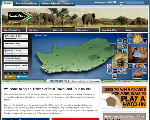 South Africa's tourism site uses an interesting trip finder interface prominently on their home page, along with strong colors and tabs. Overall, it's a pleasure to use and provides plenty of useful information.
Puerto Rico
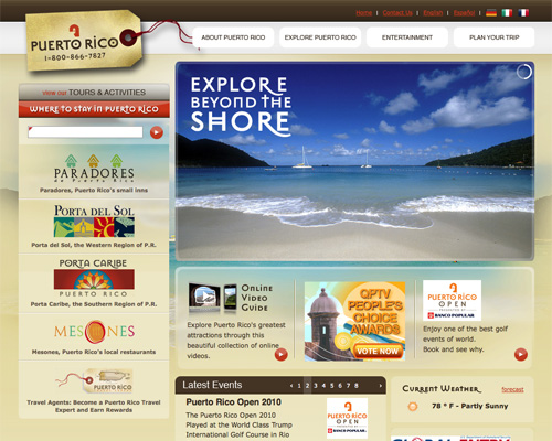 Puerto Rico's tourism site is definitely designed to appeal to nature-lovers and outdoor types. The brown and tan color scheme and use of transparency give the whole site a very sophisticated feel.
Montana (USA)
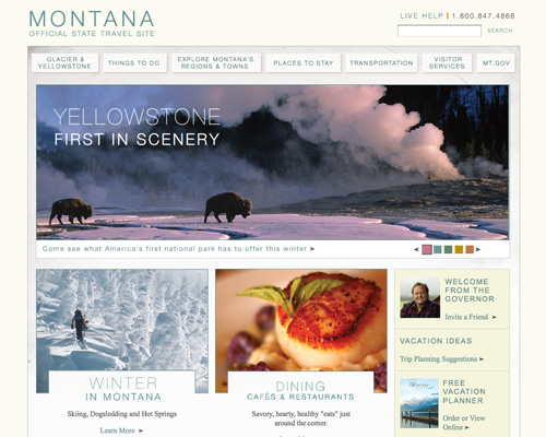 Montana's site has a very light color scheme and a surprisingly elegant layout. The slideshow immediately below the main navigation showcases Montana's attractions, more of which are displayed lower down on the page.
Singapore
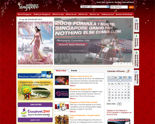 Singapore's website color scheme is primarily red, with a decidedly Asian motif. The background and tabbed navigation are the best parts of the design, and what really give it its unique atmosphere.
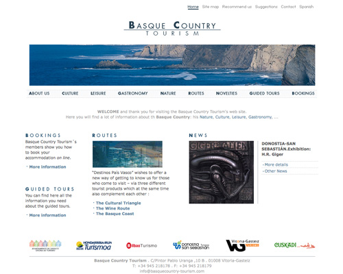 The Basque Country Tourism site is one of the most minimalist on this list, and makes great use of typography to give it style.
Sonoma Wine Country (California, USA)
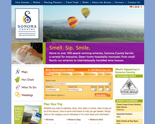 Sonoma's website makes use of a fairly traditional top navigation and bold header graphics. The site also features multiple icons and bright colors, echoing the main header image.
Gladier Country (Montana, USA)
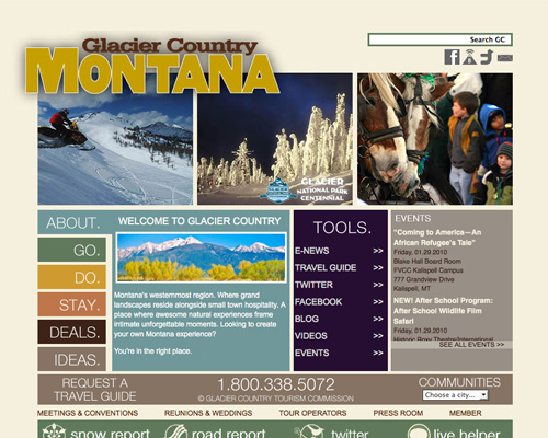 This site uses a muted, dark color scheme with mostly white text. There are also links to various social media sites.
Finger Lakes Wine Country (New York, USA)
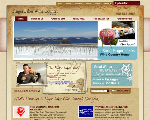 The Finger Lakes website makes heavy use of background textures, and the wine-colored accents and text are entirely fitting.
Hunter Valley Wine Country (Australia)
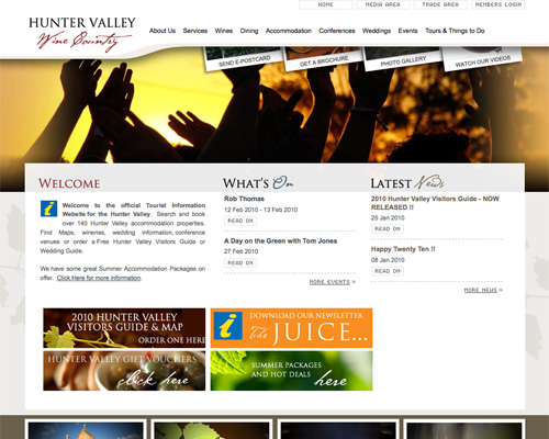 The Hunter Valley Wine Country site uses a subtle off-white, white and burgundy color scheme and a slideshow in the header. The Polaroid-styled navigation links are a nice touch that set it apart.
Lancaster County (Pennsylvania, USA)
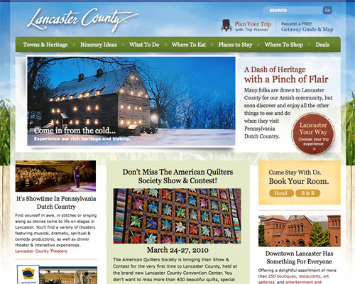 The Lancaster County site has a great country feeling to it while still feeling modern and fresh. It's an excellent representation of what the area has to offer.
South West England
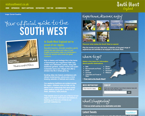 The official South West England tourism site uses a simple color scheme of blue, green, and white, and has a very informal feeling to it. It's a great representation of what the area has to offer, especially with the large background image of the Cornish Coastline.
Showcase of Tourism Website Designs
New York City (New York, USA) The NYCGO site makes use of vibrant colors and a grid-based layout.
London
 London's site is more subdued and uses a variety of shades of blue and gray in its design.
Kansas City (Kansas, USA)
 The Kansas City tourism website has a vibrant color scheme of orange, blue, and lime green, as well as a striking header and simple navigation.
Baltimore (Maryland, USA)
 Baltimore's tourism website also makes use of a blue, orange, and green color scheme, though the layout is entirely different.
New Orleans (Louisiana, USA)
 The New Orleans Online site uses a dark, muted color scheme paired with a white content background and tan overall background. The site feels a bit crowded, but is still easy to use and navigate.
Philadelphia (Pennsylvania, USA)
 Philadelphia's official tourism site makes use of a slideshow that showcases the city's attractions and accomodations over much of the home page. In fact, on a widescreen monitor it may be the only thing you see when you first visit the page. But the effect is stunning and really makes the site stand out.
Ocean City (Maryland, USA)
 Ocean City, Maryland's site has a very beachy feel to it—perfectly appropriate for this particular city. The use of and orange, blue and off-white color scheme adds to the summery feeling.
Vancouver (British Columbia, Canada)
 Vancouver's site uses a mostly blue and gray color scheme with bright accent colors. The also include social media links (Twitter and Facebook) right on the home page, a trend more city tourism sites are adopting.
San Antonio (Texas, USA)
 San Antonio's official tourism site has a muted tan, brown and maroon color scheme that adds to its "Old West"/Southwest feeling. The addition of some subtle grunge elements further enhances the effect.
Saint John (New Brunswick, Canada)
 Saint John's tourism website has a very simple, almost minimalist home page that makes good use of color. It includes a slideshow showcasing the city's attractions, as well as links to social media (Facebook and Twitter).
Denver (Colorado, USA)
 Denver's site uses an interesting header and background image. The use of bright green accents throughout the design lend the site a more modern feeling, while also echoing the city's outdoor recreation opportunities.
Boston (Massachusetts, USA)
 Boston's tourism site uses a red, white and blue grid layout, with a slideshow behind the main navigation.
Los Angeles (California, USA)
 The Los Angeles tourism website has a clean, modern design and layout. It uses bright colors against a white background and multiple content areas, as well as tabbed top navigation.
State, Province, and Country Tourism Sites
Because of the more varied attractions that these sites have to represent, they're often trickier to pull off than city sites. But the ones featured below each have their own unique look and still manage to appeal to a broad audience. Maine (USA) Maine's tourism website changes with the seasons (it's currently blue with a snowy motif), uses simple, vertical navigation and a slideshow of attractions.
Virginia (USA)
 The official Virginia tourism site has an elegant, slightly old-world feeling to it. The burgundy accent colors hint at Virginia's burgeoning wine industry, and the whole thing evokes a feel of southern hospitality.
California (USA)
 California's website has a very interesting slideshow-type navigation on their home page with is a pleasure to use. The site feels fresh while still maintaining a very neutral appearance that should appeal to a wide range of visitors.
Spain
 Spain's tourism website makes use of bright colors and multiple navigation areas.
Sweden
 Sweden's website has a great layout and clean blue, white, and gray color scheme. They use a large header image to immediately capture your attention, and drop-down navigation leaves the page looking uncluttered.
Washington (USA)
 A gorgeous slideshow is the primary focus of the home page for Washington State's tourism website. The subtle, natural-toned color scheme is sure to appeal to nature-lovers, which is what the site seems to focus most heavily on.
Bermuda
 Bermuda's unexpected color choice—pink—sets this apart from other tourism sites. The overall layout is inviting and features a large, interactive header image.
South Africa
 South Africa's tourism site uses an interesting trip finder interface prominently on their home page, along with strong colors and tabs. Overall, it's a pleasure to use and provides plenty of useful information.
Puerto Rico
 Puerto Rico's tourism site is definitely designed to appeal to nature-lovers and outdoor types. The brown and tan color scheme and use of transparency give the whole site a very sophisticated feel.
Montana (USA)
 Montana's site has a very light color scheme and a surprisingly elegant layout. The slideshow immediately below the main navigation showcases Montana's attractions, more of which are displayed lower down on the page.
Singapore
 Singapore's website color scheme is primarily red, with a decidedly Asian motif. The background and tabbed navigation are the best parts of the design, and what really give it its unique atmosphere.
Regional Tourism Sites
Regional tourism sites often have an easier time of it than country, state, or city sites. This is often because they focus on a single regional attraction or amenity (such as wine or outdoor activities), which makes it easier to target a specific audience. Basque Country Tourism (Spain) The Basque Country Tourism site is one of the most minimalist on this list, and makes great use of typography to give it style.
Sonoma Wine Country (California, USA)
 Sonoma's website makes use of a fairly traditional top navigation and bold header graphics. The site also features multiple icons and bright colors, echoing the main header image.
Gladier Country (Montana, USA)
 This site uses a muted, dark color scheme with mostly white text. There are also links to various social media sites.
Finger Lakes Wine Country (New York, USA)
 The Finger Lakes website makes heavy use of background textures, and the wine-colored accents and text are entirely fitting.
Hunter Valley Wine Country (Australia)
 The Hunter Valley Wine Country site uses a subtle off-white, white and burgundy color scheme and a slideshow in the header. The Polaroid-styled navigation links are a nice touch that set it apart.
Lancaster County (Pennsylvania, USA)
 The Lancaster County site has a great country feeling to it while still feeling modern and fresh. It's an excellent representation of what the area has to offer.
South West England
 The official South West England tourism site uses a simple color scheme of blue, green, and white, and has a very informal feeling to it. It's a great representation of what the area has to offer, especially with the large background image of the Cornish Coastline.
Conclusion
If you're tackling the design of a tourism website, whether official or unofficial, realize that you can't always be all things to all people. Focus on a few demographics you want to reach while trying not to alienate any other target groups for the best result. And make sure you look through plenty of existing sites, both the good and the bad, to get an idea of what's already been done, what's popular (slideshow headers should be on this list) and what does and doesn't work.Further Resources
While not all of the resources below apply specifically to general tourism sites, they still offer some useful and pertinent information that might come in handy.- How to Build a Website for a Tourism Business An eHow guide on building tourism business websites.
- Building Traffic to a Travel Website with 43Places A short post on building traffic using 43Places.
- Building a Destination Website - Part 1 The first in a series of comprehensive articles on building travel websites.
- 5 Link Building Strategies for Travel & Hospitality Sites A useful article on getting incoming links to your travel site.

Amazing Designs, the most attractive design according to me is of Spain’s tourism website.
I am a French designer, I come regularly to your blog
thank you for this article.
Here also a link to the video of my communications agency:
Nice collection of tourism sites. Some are definitely worth a look for inspiration. I’ve built a “tourism blog” for Puerto Rico that mostly contains reviews of activities and operators on the island. Far from an “official” site, we’ve tried to offer a different viewpoint than traditional travel sites. I’ve chosen a customized magazine theme (based on BrandfordMagazine and Mimbo) for our WP-driven site. Definitely has more of a “newspaper” feel to it.
Great roundup – my favourite is Philadelphia’s site, just beautiful :).
I need a vacation!
great idea for a post
Awesome roundup. Superb collection. Its really hard to choose the best, but my personal favorite is Philadelphia & Kansas City.
Thanks for sharing.
Thanks for the article! Very interesting to see how cities (try) to profile themselves!
I found one mistake: the screenshot of “Basque Country Tourism (Spain)” is linked to visitsingapore.com!
I may be biased because it’s my hometown, but the Philadelphia site is gorgeous. It’s everything I like about a website: clean, organized, and large imagery…
Great showcase. Conceptual and shows different cultures.
I think http://www.istanbul.com/ has to mentioned as well.
wow, what a collection, NYCGO, KANSAS and ofcourse PHILADELPHIA are my favs :) Thanks for the great collection.
Great summary of sites… one I feel that deserves to be on this list, http://www.australia.com/
Nice collection. Philadelphia and NYC are my faves.
I’ve recently been putting together a visitors guide site for Glasgow and find some of these a bit conventional, but perhaps that is the nature of tourism where people just want to see the cliches asap.
Hi Buddy!!!
Very nice & Superb site for tourism portal.. thanks for sharing..
Norway and Australia also have fantastically designed tourism websites with great functionality! Well worth a look guys
I wonder how much of the design was left to the designer and how much was a result of the dreaded ‘design by committee’ that often afflicts public sector organisations.
Great post, thanks for the roundup.
I love the South African Tourism website. The flash-based trip planner is really interesting and works well. Google maps may have been used in its place, but the custom build planner is at least quite unique.
We just launched this site for a small community in Ohio http://irishisanattitude.com. It has a strong social media integration component with a Live Dashboard called “Dublin Live” http://irishisanattitude.com/dublin-live.html.
Hands-down the best tourism site I’ve seen is http://www.austintexas.org – talk about creating a visual experience and capturing the culture. Being in the tourism industry and looking to re-create our own website, this is what we aspire to have! Helpful list!
Great collection – I’ve recently posted a similar post on my blog (5 basic principles & 25 best practices for DMO websites)- take a moment and check this out at: http://aboutourism.wordpress.com/2010/02/01/5-basic-principles-25-best-practices-for-dmo-websites/
Very nice website! Very nice!
Nice! I’m loving the Philly design, very tight.
Maine has been my favorite for quite some time, but there are some other great examples here too. I work full-time on an official tourism site: http://explorefairbanks.com Hope we can make a list like this at some point.
I would like to add the website of the city Groningen (the Netherlands): http://portal.groningen.nl/ which I think is a good looking, great navigating and nice information offering region site.
thanks. im persuaded – im leaving the office and heading to the airport.
This post would have come in really handy to me as I was deciding on a style of a local geo site that I have had developed. Fortunately I was able to find a great designer and am very happy with what I got.
I put together a portfolio similar to this so I could compare and contrast what I liked and what I didn’t when I was deciding.
Thanks for the great post.
Would reccommend checking out http://www.gothenburg.com and especially http://www.seemonterey.com/
No mention of INDIAN sites here? Check the one for Bangalore city: http://mybangalore.com
Another good one is the Yakima Valley in Washington State. You can see it here(http://visityakima.com/).
Check out this site: http://www.keralatourism.org the site offers detailed information on State of Kerala – The Major Tourist Destination of India – One of the Most advised.
Love the top left of the puerto rico one. Cool post, I’ve worked on a ton of tourism sites and never even thought about this.
je trouve cet article tres interresant. je reviendrai suremenent sur ce site. bon courage
Tack!
Appears like lots of xbox enthusiasts here, I am a fan too and enjoy to play games… my gf says I play too much, but man it’s so pleasant. I’ve been playing callofduty: mw2 and halo for weeks and can’t quit! What would you guys recommend? Anyhow, appears like a sweet site, is this wordpress? I’ve created a couple pages myself and ain’t easy. Thanks for taking time to post.
NIce Work Keep it up
Here is some Finnish sites for travellers & DMC: http://www.goarctic.fi and http://www.arcticincentives.fi
Hello I have been following a while now and I was wondering If you could write a guide on deathstreaks.Would appreciate it!
good work
hello
Sharm El Shaikh – Egypt
egyptsharmtrips.com
These sites are perfectly designed and optamized.
Japan Hears About Paris Hilton’s Drug Bust and Takes Action
Trying to get information about Egypt, then there is a forum which you can use to read more about tourist places such as El Gouna or just about snorkeling in Egypt.
Thanks for the creative collection of these City Tourism Website Designs, they look so beautiful.
Tricky beast indeed.
Singapore tourism? The website is definitely better than their real tourism..
most travel sites have very nice webpages and their services are very nice too. ;”‘
its still funny how people thing its called a flashlight and not a fleshlight
Travel Morocco,Excursion Marrakech,Private Tours Morocco,Trip Sahara Desert Morocco 4×4 Morocco Trips, Marrakech Tours, Fes Trips, Morocco Camel ride, Camel Trekking Morocco, Marrakech Camel Treks, Marrakech to Fes desert tours, Fes to Marrakech desert tours, tailor made Tours Morocco, 3 days, 4days, 5, days Tours and Trips Morocco, Off Road Sahara Desert
Best design. For me the best design is Hunter Valley Wine Country (Australia. I would be pleased if you would update me if you have new designs.
The most of these websites are quite nice. Now, the website becomes a “face” of company, it can reflect this company’s reputation, business even culture. So, now the good design is very important.
Great post. I would like to add my place called Thamel. It is well designed, visually appealing and great navigations. you can visit http://www.tourismthamel.com
Nice list , working on a tourism website now and that was really helpful . thank you
I will make sure to bring your new site to mine list so everyone can still find you. Good Luck!
Awesome collection dear:)
This is such a great list! THANK YOU for gathering all these together!
NIce Collection…. love these sites.. gr8 to see cities putting innovation to attract more people..
Really inspirational designs. Thank you
Just visited kathmandu.Had a great experience.Found a very nice website.Well designed with great combination of colors. This would be nice addition to this list.
Really beautiful collection of designs, It’s interesting they all seem to have natural, colours like blues, greens,red and nude tones. These colours must evoke the traveller’s “itchy feet” emotion. Essentially the front page must be captivating but depending on the main function of the site, must be user friendly and be clear what the purpose of the site is.
Really interesting set of design examples. Its interesting to see a slight degree of each nation’s culture and heritage shining through. Its all very subtle but evident if you look for it. I guess we could also guess the current graphic design trends prevalent in each country by having another glance over these great websites.
Write more, thats all I have to say. Literally, it seems as though you relied on the video to make your point. You obviously know what youre talking about, why waste your intelligence on just posting videos to your weblog when you could be giving us something informative to read?