
Showcase Of Formula 1 Website Designs
The 2009 Formula 1 season had an audience of over 520 million viewers, most of whom stayed up to date with the latest news on the official Formula 1 website, as well as their favorite teams websites, and even the track websites to find out current conditions and directions to the race tracks. Because of this, the F1 websites featured in this showcase probably racked up a nice traffic count over the course of the season.
But are these websites built for so many visitors? Some are perfect: jam-packed full of easy-to-find information, simple and clean navigation and beautiful animated effects. On the other hand, some of the websites aren't quite what they should be: a lack of information, no live updates and poor design. No one would expect this of a multi-billion dollar sport.
Below, we have a selection of official Formula 1 team and track websites. Which is your favorite, and how do you think some could (and should) be improved?
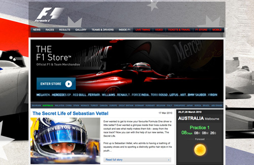
Formula 1 Official Website
The official Formula 1 website has it all: information about every race, every track, every team and every driver. It has details on previous and upcoming races, as well as weather and condition updates. Despite the website having so much information, finding your way around is incredibly easy, and it looks stunning to boot!
Formula 1 Team Websites
Compared to a lot of the track websites below, the official Formula 1 team website designs seem to have had a lot more time and effort invested in them, especially the ones for Vodafone McLaren Mercedes, BMW Sauber F1 and Virgin Racing. Some websites have made use of current design trends and social networking websites such as Twitter to update their websites with the latest news on a regular basis.
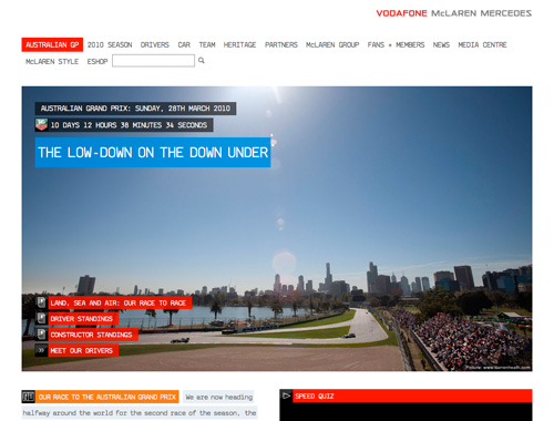
Vodafone McLaren Mercedes
A really nice, clean website. The articles are easy to read, and the menu disappears to help users focus on the articles. It has a great live feed during the race, with feeds from the team's radio, and it displays the real-time position of cars on the track, statistics with current speeds and plenty more.
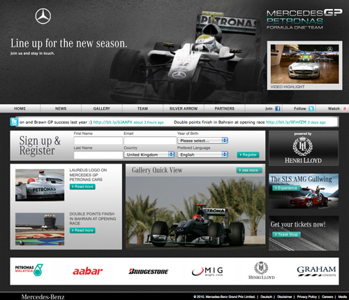
Mercedes GP
This design has the corporate identity of Mercedes, but unfortunately it appears alongside a logo that has far too many gradients, making it difficult to read; updating the logo alone would make this website much more appealing! During races, the website has a text crawler that displays the Twitter feed, keeping users up to date on the latest happenings.
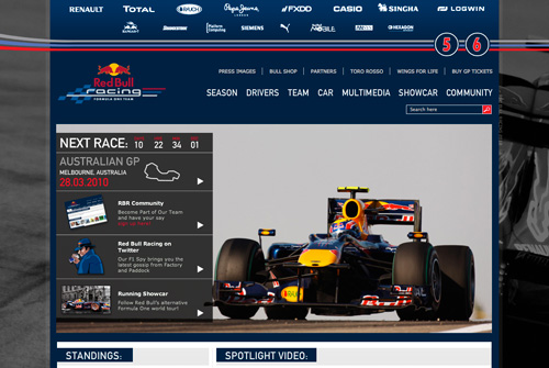
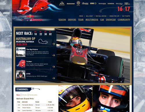
Red Bull Racing
The large header shows the team's sponsors. This website is easy to navigate. It has the same structure as, but a different design than, the other team powered by Red Bull: Toro Rosso. Unfortunately, it doesn't provide a live feed during races, which would have been helpful to people who don't have access to a television or radio and want to see stats for this particular team rather than for all of the competitors.
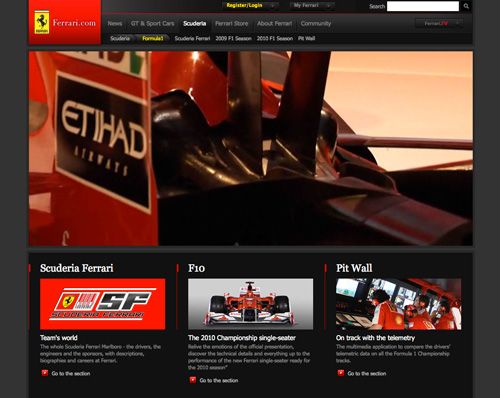
Ferrari
Even though this team has been a champion for a long time, it doesn't have a dedicated website; just a sub-section of the main Ferrari website. Because of this, you can't expect to find much information or much to do.
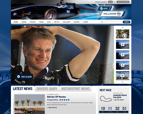
AT&T Williams F1
This website is mainly structured in two parts: the videos on the front page and then the rest of the pages, which are mostly text. The design is reasonably sleek and easy to navigate.
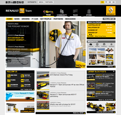
Renault F1
A clean and simple design with a great color scheme. Many people, though, feel the selection of big icons could be improved.
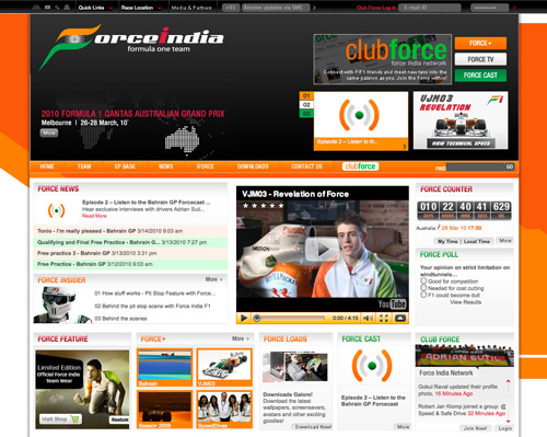
Force India F1
A well-structured design that presents plenty of information on the front page. Quite easy to navigate.
Toro Rosso
As mentioned, this website has the same structure as that of Red Bull Racing, but a different design. Other than that, not much different.
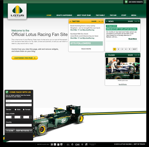
Lotus Racing
A fully Flash-based design. The first page makes great use of widgets that auto-update with content from Flickr and Twitter, keeping the website fresh.
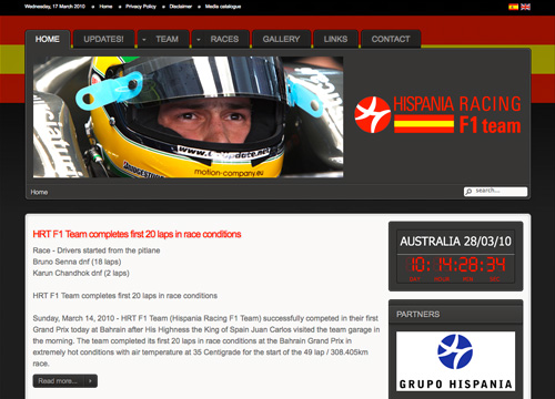
Hispania F1
A simple website with a lot of contrast in the color scheme. In some areas, the color choice makes the text difficult to read. And once again, no live feed.
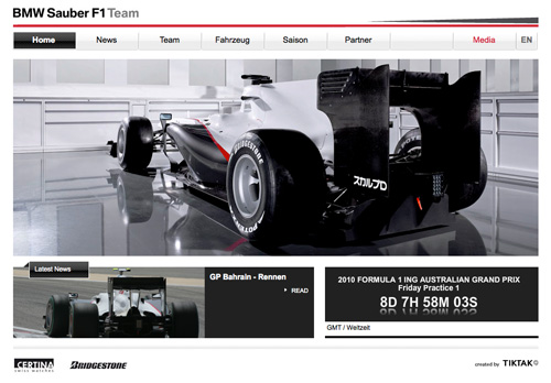
BMW Sauber F1
Yet another simple and stylish minimalist design. There is no live feed for the curent race, just a banner that displays, "Session in progress." Helpful if you want to know whether a race is on, but useless if you want to know your team's position.
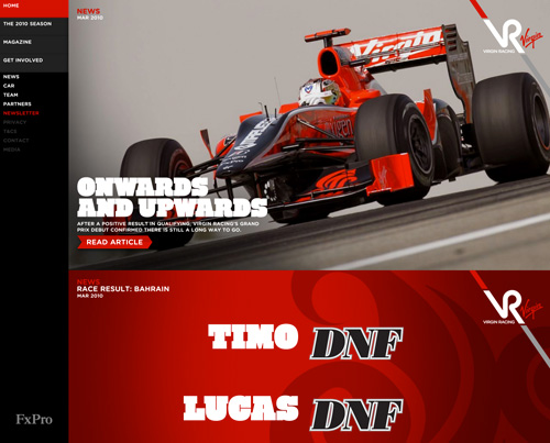
Virgin Racing
The newest F1 team has put a lot of money into its website design. The website has huge headlines and photos. Navigating and finding what you want is very easy, but once again there is no live feed during races.
Formula 1 Track Websites
A handful of the track websites featured below, such as the ones for "Grand Prix Monaco" and the "Hungaro Track," have designs that are out of date.
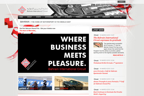
Bahrain International Circuit
This website has some modern transition effects and makes use of social networks such as Flickr to keep the page fresh and up to date. The navigation is simple to use and has a minimal color scheme to keep your eyes trained on the great content.
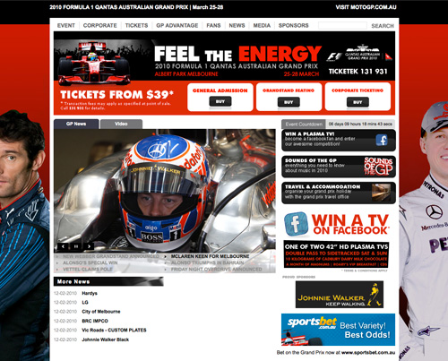
Australian Grand Prix
The Australian Grand Prix website has all the ingredients of a great design but doesn't quite pull it off. For example, the "Event countdown" and "Win a plasma TV" boxes don't quite line up. Fixing little things like this would make the website much cleaner, easier to navigate and more visually appealing overall.
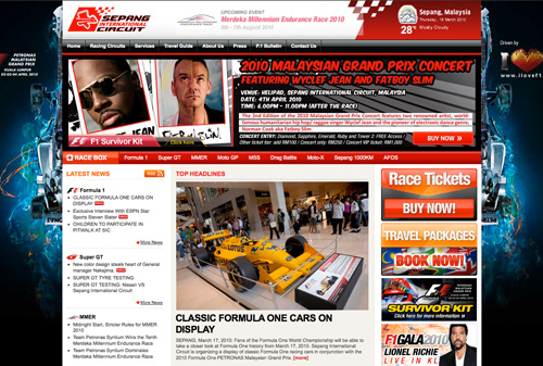
Sepang International Circuit
Sepang's official website invites visitors to subscribe to its "Latest News" section via RSS feed, something that a lot of other Formula 1 websites don't offer. It links users to its Facebook page, another great way to keep up to date on track events. The website's home page, however, seems a little busy, and if you head over to the live page, you'll notice a lot of animated images that are very distracting if you're trying to focus on text!
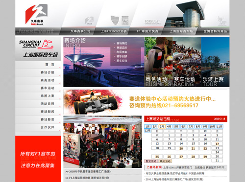
Shanghai Circuit
The website for the Shanghai Circuit seems a little unplanned, with overlapping advertisements at the bottom of the page and outdated calendars. Some elements, though, such as the sleek silver navigation on the left side, make up for some of the faults. There is also a small Flash script that plays a movie, and while the movie adds a nice touch to the overall atmosphere, the fact that it starts playing automatically is annoying!
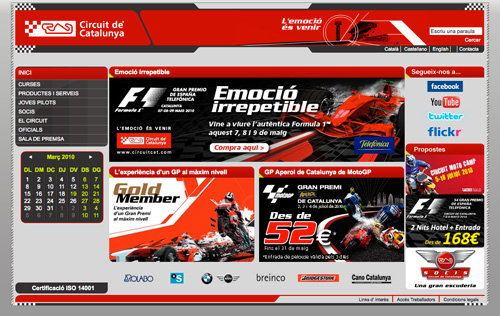
Circuit de Catalunya
Catalunya's Circuit website seems a little outdated, although it does make use of modern networks such as Facebook, YouTube, Twitter and Flickr to get viewers involved and keep them up to date on the latest happenings. The biggest fault of the website is that it doesn't make use of the entire browser, taking up only a small portion of the top left. Navigating is reasonably easy, though.
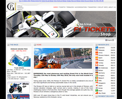
Monaco Grand Prix
The Monaco Grand Prix website has a very simple design, and while not the most modern or attractive we've seen, it does make it easy to find your way around and purchase tickets.
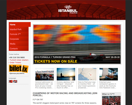
F1 Istanbul Park
The website for Istanbul Park, like many others, is clean and simple. It presents great track photos on the home page using some nice Flash transition effects, and the information is easy to read. The navigation menu is clean and simple, and overall the website is very easy to use.
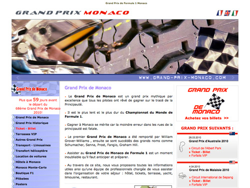
Grand Prix Monaco
This website is cleary due for an update. It almost feels like its various elements were done by different designers who had no contact with each other. It does the job, but for a multi-billion dollar business, we can expect a little more than this, right?
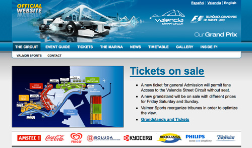
Valencia Street Circuit
Someone has clearly put thought into Valencia's Street Circuit website, but apparently did not have the skills to execute. The header is pretty sleek, but below that we come across misaligned typography, visible (i.e. incorrect) HTML code and "Object not found" errors. With some quick fixes, the website could be greatly improved.
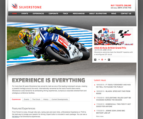
Silverstone Track
This is more like it! A modern, up-to-date design that is stylish, easy to navigate and pure gold to the eyes. Finding the latest news is easy because of the dedicated area on the home page. If you're a big enough fan, you can easily sign up for the newsletter to stay informed on special offers and exclusive deals. All it needs now is a Twitter and/or Facebook feed!
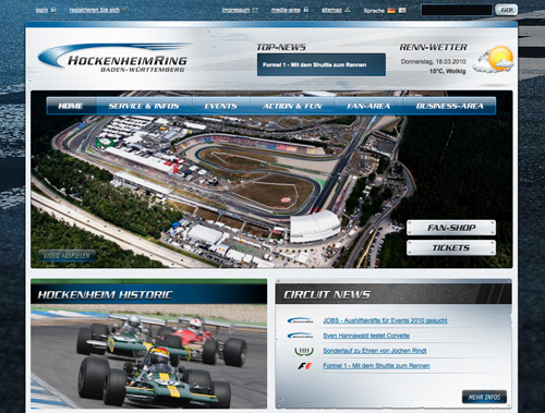
Hockenheimring Baden-Wurttemberg
Hockenheimring's website has been given a metal chrome look, which is a pretty sweet idea for a motor-racing track. Unfortunately, it hasn't pulled it off too well. Some images don't have transparent backgrounds, some don't show up at all and a lot of the typography is hard to read, causing eye-strain for the visitor.
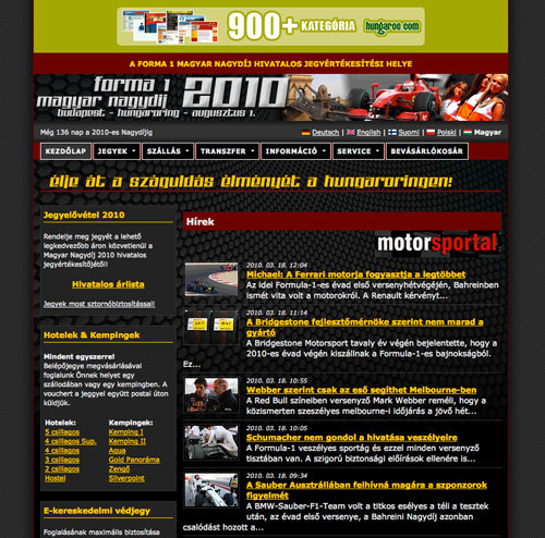
Hungaro Track
Like the Grand Prix Monaco website, this one is clearly due for an update. The design doesn't seem to have been touched since the ’90s. Still, it does make a handful of useful information relatively easy to find. Overall, quite busy, a little over the top in places, and it most definitely doesn't make use of the large screens that most of us have nowadays.
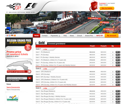
F1 Belgium Spa Grand Prix
This clean and simple website for Belgium's Grand Prix track has been well designed and is easy to navigate. Dots are a little over-used in places, though, such as the "My Account" and "See my basket" buttons.
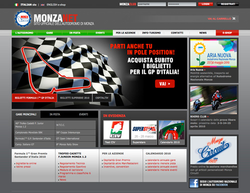
MonzaNet
MonzaNet is a little tight in spots but reasonably well laid out. Strong bold colors draw attention to certain areas of the website. Finding what you're looking for is relatively easy, and a link to the Facebook page lets you keep up with all the chatter.
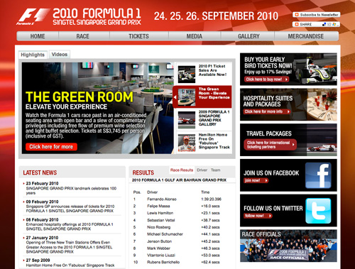
Singtel Singapore Grand Prix
Singtel's Singapore Grand Prix website is packed full of great information and goodies to keep you entertained (such as videos and a gallery). It has the latest results and travel packages, as well as easy access to Facebook and Twitter pages so that you can stay up to date. It also offers a newsletter and a share button that allows you to share a page with a click or two of the mouse.
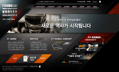
F1 Korea Grand Prix
This Grand Prix website, being Korean, makes use of some extraordinary effects, and it even has a anime/magna-style e-book to keep you entertained until the race begins. The website is easy to navigate and visually appealing.
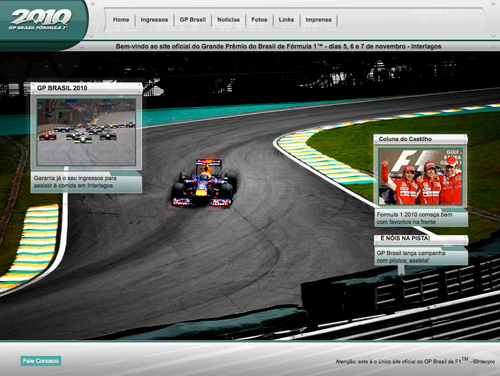
GP do Brasil de F1
This website, like a couple of others in the showcase, doesn't make full use of the browser's size, either in height or in width. It isn't well aligned and doesn't make for a good user experience.
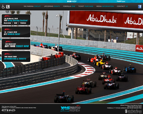
Yas Marina Circuit
Yas Marina's Circuit website is sleek and appealing. Unfortunately, it doesn't work quite as well as it looks. The background images stretch and shrink (and thus distort) depending on the size of your browser, and the drop-down menus are a nuisance after a few minutes of use.
Related Articles
- Showcase: Pictogram Signage
- 100 Essential Web Development Tools
- Ultimate Guide to Grid-Based Web Design: Techniques and Tools
- Progress Trackers in Web Design: Examples and Best Practices
- Showcase of Modern Navigation Design Trends
- Call to Action Buttons: Examples and Best Practices
Huge thanks go to Alex Cioflica for suggesting this showcase and contributing to the article.
(al)
I was quite shocked myself at some of the sites when going through them when writing this post. From such a huge sport (just think how much money they’re making) you’d expect some of those sites to be a bit more… modern!
wow, i am amazed of how bad some of these designs actually are.
Really Simple & Nice Looking Websites
great idea for a roundup. :)
Hey, very nice that your showcasing F1! Especially for us F1 fans, writers and site owners.
Maybe a post on F1 blogs & news sites soon? (just wait until we release our new site ;) )
Dosen’t fall into the team or track catagory, but, the BBC’s F1 site is very well done…
The leaderboard updates via AJAX during the races, animating who’s moved up & who’s moved down positions
http://news.bbc.co.uk/sport1/hi/motorsport/formula_one/
good idea! http://supercomentario.com.br/2009/05/27/aerodinamica-dos-websites-da-formula-1/
Can’t believe that Monaco, with loads of money, could make such a bad job. I’m sad that my country, Brazil, didn’t make a good job either :(.
By the way, nice collection!
Can’t agree more Gregório on your opinion about our country. It’s saddening to see a team like ferrari with such a lack of effort to bring a better experience to the user.
Unique round up of websites.
Really nice F1 websites. You really wont think F1 will have great websites but I’m wrong lol.
Cool Round Up.. Nice collection.. GP do Brasil de F1 looks Awesome.
Virgin Racing site is kinda hot. Very interesting to see the collection all together. Nice research.
These are some great sites, I really like the Korean design Great list of sites.
hi, if you are fanatic of f1 timelapses and other, check out this site thath i maked for a frined of mine!
http://www.f1matrix.it/gp_2010_eng/index.html
Don’t forget the engine manufacturers! I didn’t design this but I did code it up:
http://www.cosworthformula1.com/
I really like the McLaren site, cool style.
I have a countdown to each Formula One Grand Prix that I update on my site, check it out: http://waytoogood.ca/doing/2010-formula-one-countdown
How about driver websites? Heikki and Karun have nice websites.
Very nice sites.
I’m happy with my F1 site: http://www.enterf1.com
We concentrate on the information and text display on the site where as some of the sites above use images and graphics much more.
Good Collection of showcase :))
Very nice website about “Formula 1 statistics” (2008-2010)
http://esporte.ig.com.br/grandepremio/inforace/
What about the Torro Rosso pilot Buemi website?
It’s great, flash with full screen video!
BR,
Mathieu
And what about f1 driver websites?
Helped me derive lots of concepts for such websites.
Thank You, it’s very very helpful.
:)
Great roundup! Thanks for sharing.
It looks to me that the new McLaren site has it all. Clear, fast and oh so readable. But watch out Big Mac! The other marques will be picking the best out of what you’ve done and using it. Stay one step ahead and keep your fans cheering! And thanks.
Amazing Showcase of Collections..Nice Design… Thanks for sharing…
Great post. Just stumbled across an excellent site with UK government documents on it – http://www.officialdocumentwatch.com is a really well made site and them seem to be very up to date – always posting the latest UK government documents released to the public. Worth a look.
Nice. You have a couple of great points The problem with law is that it doesn’t always work effectively. It is a failed system and needs to be rectified.
hey,Superb blogging dude! i am Fed up with using RSS feeds and do you use twitter?so i can follow you there:D.
PS:Have you thought putting video to your web site to keep the people more interested?I think it works.Best regards, Shaunta Scarfo
Super information,I have Tweeted your post, Thank you
You should check out Chandhok’s website !! UBER COOL and great design and content !!!
http://www.karunchandhok.com
Gday thanks to you for the blog.
One I built a number of years ago, a little dated now but still visually impressive I think. Not the most usable but that was out of my control ;-)
http://www.f1play.com
I enjoyed reading this. Thanks for sharing.
Weird , this page shows up with a dark color to it, what shade is the primary color on your webpage?
Very nice list of the formula 1 website.
what about this one:
http://www.exclusivegp.com
It has a slick design and nice little touches without being too over the top