
Comparison Between Adaptive vs Responsive Design For Ecommerce Conversion

The pervasiveness of performing tasks on the go has led to the increasing importance of catering to different screen sizes. The need to deliver the same excellent user experience (UX) whatever device a customer is on has posed significant challenges to web developers. And this has led to a debate on whether taking adaptive or responsive design is the better approach.
In this article, we try to shed light on both sides of the argument, helping you decide on which approach you should adopt for your eCommerce site.
ECommerce Stats
But before we dive into the matter of adaptive vs. responsive, take a gander at some of these stats:
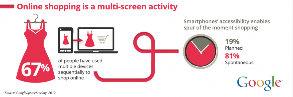
- 67% of customers use varying platforms and devices to conduct their online shopping.
- 40% of online transactions are done via a mobile device.
- 47% of users expect websites to load in less than 2 seconds. Therefore, 27% of customers have abandoned their shopping carts because of slow loading times or complicated checkout processes.
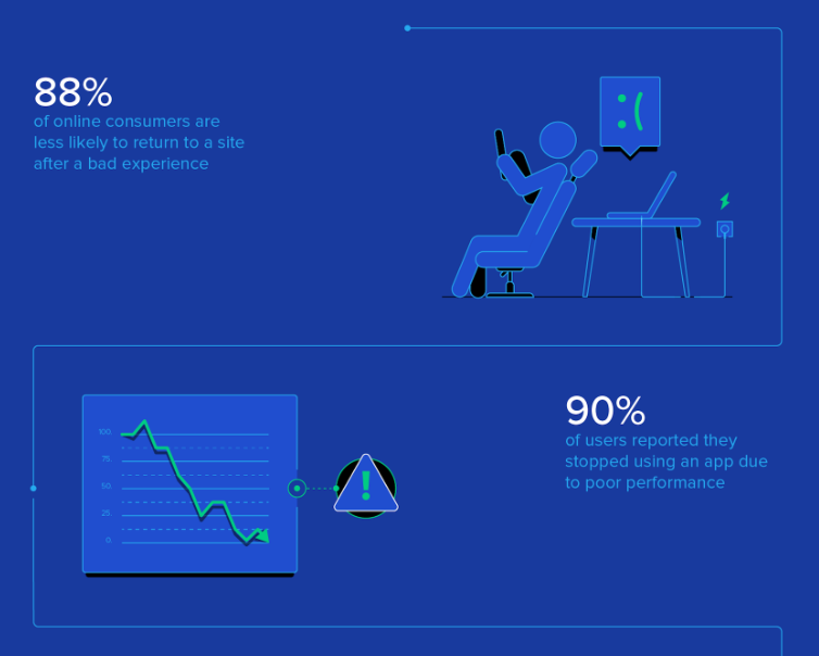
- 90% of smartphone users say they would continue to shop at a particular site if their UX is good. Conversely, 88% will never return to a store after encountering poor UX.
Choosing between Adaptive and Responsive Design for better ECommerce Conversion
So with those numbers in mind in the context of eCommerce sites, here are some of the reasons for using both adaptive and responsive designs.
Why choose Adaptive?

Loading Speed
As alluded to in a couple of the stats above, slow loading speeds have a tremendous impact on websites’ conversion and bounce rates. In this regard, websites built using adaptive design generally load faster than responsive ones. This is because adaptive sites only transfer the necessary assets specific to each device.
Ease of Implementation
This area’s a bit contentious. There are those that believe adaptive designs are more difficult to build owing to the need for different layouts for different devices compared to responsive ones that only require a single layout.
However, while you might just need one layout, responsive sites entail more time and effort upfront due to all the extra attention developers need to place on the site’s CSS and organization to ensure the website is fully functional on all screen sizes. And when it comes to eCommerce sites, whether it’s adding items to cart or the checkout process, you want everything to work as the customer expects it to.
Tailor-Made Solutions
In theory, adaptive design better ensures the best possible UX, in accordance with whichever device the user is on. As its name suggests, adaptive design adapts to the user’s situational needs and capabilities.
For example, if you were driving through a long tunnel, you’d prefer a navigation screen that adapts to the environment by adjusting its brightness. This is possible with adaptive design, as opposed to responsive design where a screen flows from desktop design into smaller devices.
Additionally, you can also design to optimize advertisements for your relevant user interfaces based on user data from smaller screens. The same can also be applied when it comes to imagery. With adaptive design, you can keep images’ size ratio without reducing or compressing its quality - a crucial aspect when it comes to users using different screens.
As well, if a user frequents a website, store, restaurant, or general area, a profile is created, which can be used for behavioral targeting and other personalization for UX purposes. When it comes to eCommerce, this could come in the form of shipping information, relevant to the user’s location, or product recommendations (using their activity history).
You can Re-use Existing Website
With this design methodology, developers don’t need to re-code and build an existing website from the ground up. More complex websites are built with legacy code - for these, starting from scratch simply isn’t an option. This will also make it easier to look for someone selling web design services.
Why choose Responsive?
Seamless Experience / Familiarity
Because of its fluid nature, users get the same, seamless experience they would whether they’re on a laptop, smartphone, or tablet. This breeds a feeling of familiarity, and ultimately, trust.
However, it’s important to note that developers need to keep an eye on the visual hierarchy of responsive design projects to ensure this fluidity. This entails a lot of testing with different devices. And with imagery being integral to eCommerce sites, the importance of this is only heightened.
SEO-Friendly
With responsive websites, a single web crawler agent only needs to crawl your page once, as opposed to adaptive sites where different crawler agents need to do so multiple times in order to retrieve all versions of the content. As such, responsive sites directly improve the crawling efficiency, which in turn, indirectly helps search engines index more of the site’s content.
And with eCommerce having numerous product pages under different categories, making it easier to crawl can go a long way. Learn more about eCommerce SEO: "Killer eCommerce SEO"
Budget-Friendly
For those looking to set up their eCommerce site from scratch, responsive design is easier and faster to implement. This also allows you to save on development, support, and maintenance costs because you’re essentially using the same content across all devices. This opens up more time for other essential tasks like marketing, customer support, and content development.
As well, apart from not needing multiple layouts for different screen sizes and device types, you can also organize and control all your content from a centralized location.
Best Examples from Brands
To give you a better visual of how both adaptive and responsive translate, here’s a shortlist of some of the best examples.
Adaptive Design Examples
Staples
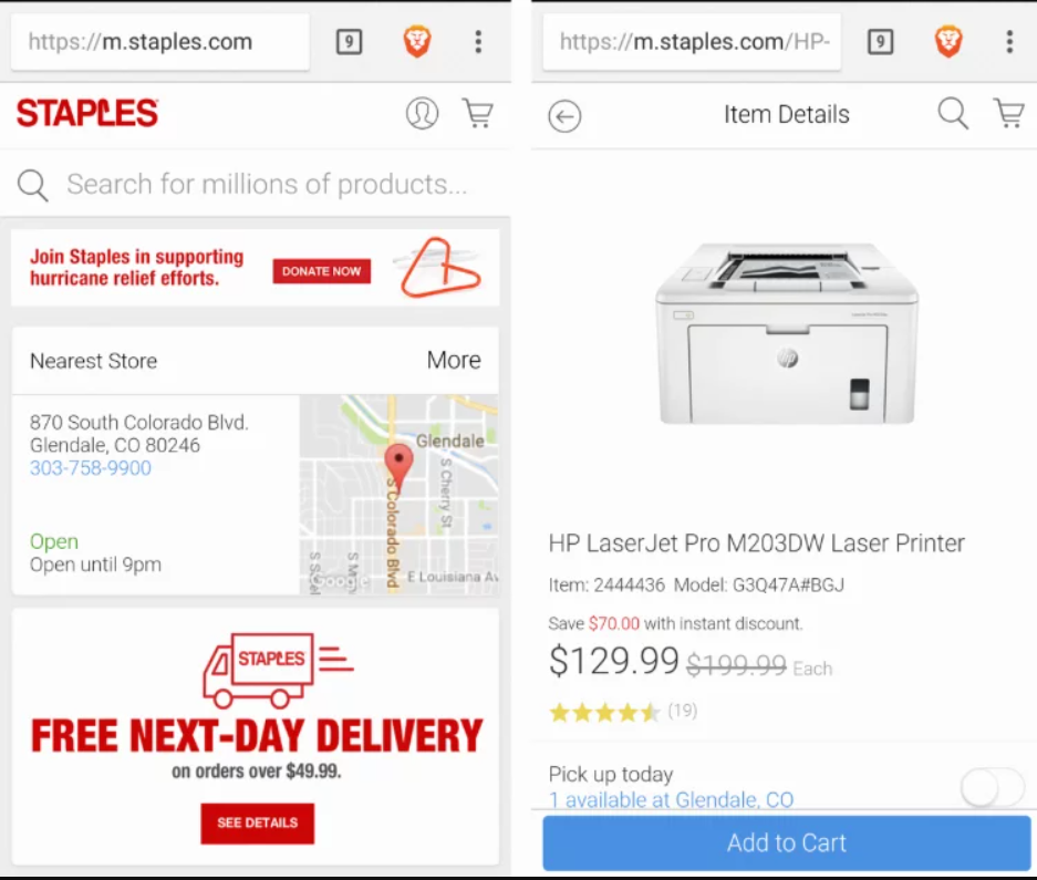
Here, you can see how Staples focuses on highlighting what users on smaller screens are more commonly looking for. These include vital information like location, contact details, personalized shipping information (along with which stores are closest to the user), and the most important product info.
That information provided tailored to the specific user. This leads to a unique, and ultimately, better customer experience.
Nike
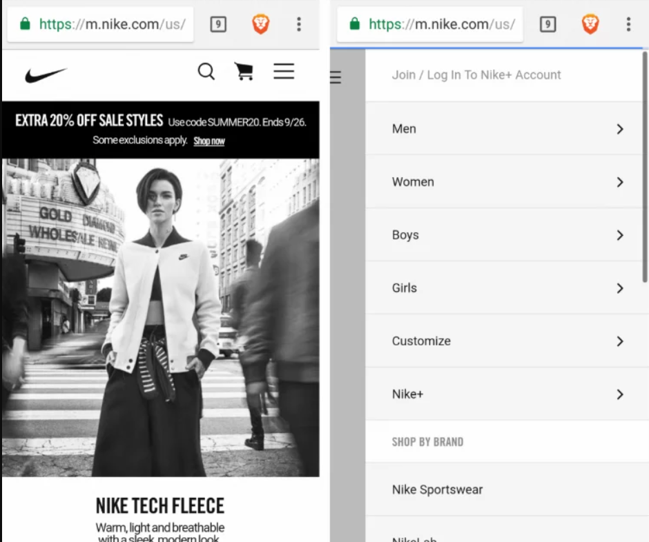
Again, this is a great example of presenting users on the surface with what they mainly need, while keeping other options just a few taps away. Additionally, Nike’s desktop design for this page had a looped video on the homepage. Conversely, the mobile version only has a static frame, designed to save on both bandwidth and hardware resources.
Responsive Design Examples
Hickory Farms


Here, you can see that Hickory Farms allows its customers to shop either by category or price - whether on desktop or mobile. The categories customers would’ve been used to on desktop are also presented very similarly on its mobile counterpart - a seamless experience that’s a mark of responsive design.
Frederick’s


Frederick’s site features excellent use of CSS and Javascript to create a clean, responsive website. The store locator and cart buttons are in the header, a perfect place for it as one of the most used features. And as you would expect from a responsive site, the shopping experience is smooth both on desktop and mobile.
Things to Keep in Mind
For a simpler look at what might be a better fit for your goals and objectives, here’s a quick guide for when to use each.
Use Adaptive When
- Ideal for existing complex websites where an equally capable mobile version is a must.
- Recommended for speed-dependent sites.
- Great for providing highly-targeted experiences, particularly when it comes to users’ location and connection speed.
- Ideal for those who need more control over how their website is delivered to different users and different devices.
Use Responsive When
- Perfect for small to medium-sized companies looking to update their existing websites at a reasonable price.
- Ideal for those looking to build a brand new website.
- Recommended for service-based industries as their sites are mainly composed of text and images.
Verdict
As you can see, there are merits to both adaptive and responsive designs. It’s mainly up to what resources you currently have, and what goals and objectives you want to accomplish.
Which design approach do you think suits your eCommerce business better? Let us know in the comments below.
Photo by Domenico Loia on Unsplash