
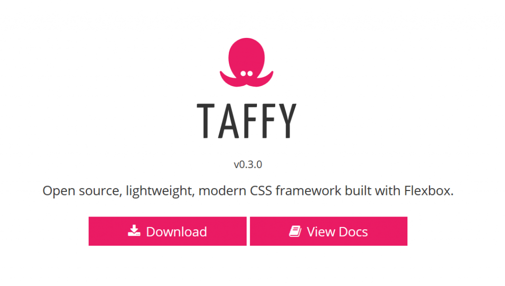
Taffy: Slim CSS Framework Based on CSS Flexbox
The syntax of CSS Flexbox isn't that easy to grasp. If you don't deal with it on a daily basis, you'd rather use something more straightforward if and as needed. The tiny CSS framework Taffy is that thing.
 This way, Carlile manages to make the flexibility of Flexbox accessible to anyone that can tell 12 columns apart from each other. He intentionally forgoes extensive configuration options in the style of Bootstrap or Foundation.
Thus, Taffy is more of a boilerplate than a framework. Because of that, at 11 kb, the size of the CSS is minimal and comes without any dependencies. Taffy still delivers styling and typography, but more as a basic equipment.
Taffy is created using Sass/SCSS and is available for download as an open source project under the liberal MIT license from the project's website. Here, you'll also find a sufficiently elaborate, and comprehensible documentation.
This way, Carlile manages to make the flexibility of Flexbox accessible to anyone that can tell 12 columns apart from each other. He intentionally forgoes extensive configuration options in the style of Bootstrap or Foundation.
Thus, Taffy is more of a boilerplate than a framework. Because of that, at 11 kb, the size of the CSS is minimal and comes without any dependencies. Taffy still delivers styling and typography, but more as a basic equipment.
Taffy is created using Sass/SCSS and is available for download as an open source project under the liberal MIT license from the project's website. Here, you'll also find a sufficiently elaborate, and comprehensible documentation.
 As this approach typically won't match the designer's wishes, there are several ways to overrule this default regulation. For instance, you could assign percentages to the individual columns, making them take up a certain amount of the available space. For instance, adding the class
CSS Flexbox: Induction Inevitable
Here at Noupe, we've already dealt with Flexbox several times. We showed you its general advantages in this article. To get to results faster, I showed you a couple of Flexbox patterns, essentially code snippets, right here. Over at t3n, I presented the small tool Flex Layout Attribute, which is also meant to speed up the workflow. Last but not least, I found the Fibonacci Flexbox Composer. But in the end, I can't deny that Flexbox needs an above average amount of induction.Flexbox Made Easy With Taffy
The US-American web developer Logan Carlile used older frameworks as models, like the popular boilerplate 960.gs. He oriented himself towards grid systems, which provide a design structure in a syntax closely resembling natural language, but integrated CSS Flexbox as the foundation.
This way, Carlile manages to make the flexibility of Flexbox accessible to anyone that can tell 12 columns apart from each other. He intentionally forgoes extensive configuration options in the style of Bootstrap or Foundation.
Thus, Taffy is more of a boilerplate than a framework. Because of that, at 11 kb, the size of the CSS is minimal and comes without any dependencies. Taffy still delivers styling and typography, but more as a basic equipment.
Taffy is created using Sass/SCSS and is available for download as an open source project under the liberal MIT license from the project's website. Here, you'll also find a sufficiently elaborate, and comprehensible documentation.
Creating Columns Using Taffy
As mentioned before, Taffy is reminiscent of popular grid systems, while following the responsive mobile-first approach, and working with breakpoints for different display sizes. As a container for the content, the class.container is used.
This class cares for keeping the content centered and limited to 960 pixels as long as the viewport is no wider than 1,000 pixels. Up to a viewport size 1,192 pixels, the content container has a width of 1,152 pixels, and on even broader displays, the content is restricted to 1,344 pixels. These, seemingly random values were selected, as all of them can be divided by 12.
The actual grid is placed within the container class. For that, the class .grid is used, within which columns are defined via .grid_col. The class .grid can be seen as a line here. Within that line, all columns generally get the same width. The more columns, the slimmer the individual one. That's as logical as it sounds.
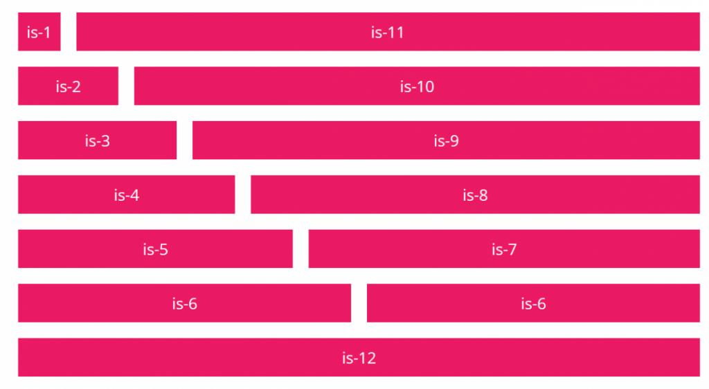
As this approach typically won't match the designer's wishes, there are several ways to overrule this default regulation. For instance, you could assign percentages to the individual columns, making them take up a certain amount of the available space. For instance, adding the class .is-50p to .grid_col, creates a column that takes up 50 percent of the total width. The remaining columns of the respective row automatically share the leftover space.
A more precise way to divide the existing room is provided by the classes .is-1 to .is-12. The order grid_col is-1 would result in the column taking up one of 12 columns of total width. If we wanted two columns, in this case, the second one would be grid_col is-11, so that the final result is 12. This way, you get to freely distribute the columns.
Now, if a grid is displayed on a display with a width below 768 pixels, all columns turn into full-width ones, and are displayed below each other. If you want to influence the display of the individual breakpoints, Taffy offers the additions --small, --medium, and --large. These let you define that a column receives different width values on different screens, for instance.
Learning Taffy's syntax can be done within half an hour. The boilerplate takes care of typography, forms, buttons, tables, and media, as well. It's definitely worth taking a closer look at Taffy.